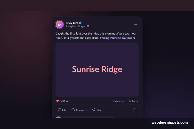
A dark Bootstrap 5 social media post card with an author header, photo, like, comment, share and save actions, and an inline comment thread. Use it in social feeds, community apps, blog activity streams or any UI mockup that needs a realistic post.
How it works
The card is an article.sp-post inside the .sp-wrap backdrop. The .sp-head holds a gradient initials avatar, the author name with a verified badge, a time element and a Bootstrap dropdown with Copy link, Mute and Report actions. Below come the post text with hashtag links, the .sp-media photo, a .sp-stats row and the .sp-actions bar.
The script runs on DOMContentLoaded for every .sp-post. The like button toggles aria-pressed, swaps bi-heart for bi-heart-fill and adds one to the count stored in data-likes. Double-clicking the photo also likes the post and plays the .sp-burst heart animation by adding sp-burst--play. The save button toggles a bookmark icon. Share uses navigator.share() when the browser supports it and otherwise copies data-share-url with the Clipboard API; if the clipboard is blocked, the link is shown in the .sp-status message instead.
The Comment button is a Bootstrap collapse toggle for the comment section and focuses the input when it opens. In .sp-comment-form the Post button stays disabled until text is typed; submitting appends a new .sp-comment (text inserted with textContent, so it is safe) and updates .sp-comment-count.
Customization
--sp-accentand--sp-accent-rgbon.sp-wrapinstyle.css: change the rose color of the active like, Post button, avatar ring and focus outline.--sp-card,--sp-surfaceand--sp-bg: recolor the card, comment bubbles and page background; use light values for a light theme.--sp-radius: rounds the card and, through acalc(), the photo.data-likeson.sp-post: the starting like count; the displayed number is formatted withtoLocaleString.data-share-urlon.sp-post: the link used by Share and Copy link.- Remove
showfrom thecollapsewrapper and setaria-expanded="false"on the Comment button to start with comments hidden. font-size: 5remin.sp-burst: makes the double-click heart larger or smaller.maxlength="280"on.sp-comment-input: limits comment length.
Accessibility
The article is labelled by the author name, and decorative avatars are hidden with aria-hidden. The verified and public icons have role="img" with a label. Like and save are toggle buttons with aria-pressed; the icon-only save and menu buttons carry aria-label. The Comment button exposes aria-expanded and aria-controls. The comment input has a visually hidden label, and confirmations such as "Link copied to clipboard." or "Comment posted." are announced through the role="status" region. Focus outlines use the accent color, and all animations stop under prefers-reduced-motion.
Usage notes
Requires Bootstrap 5.3 with its JS bundle and Bootstrap Icons. When repeating the card in a feed, give each copy a unique collapse id (sp-comments-1) and input id (sp-comment-input-1).