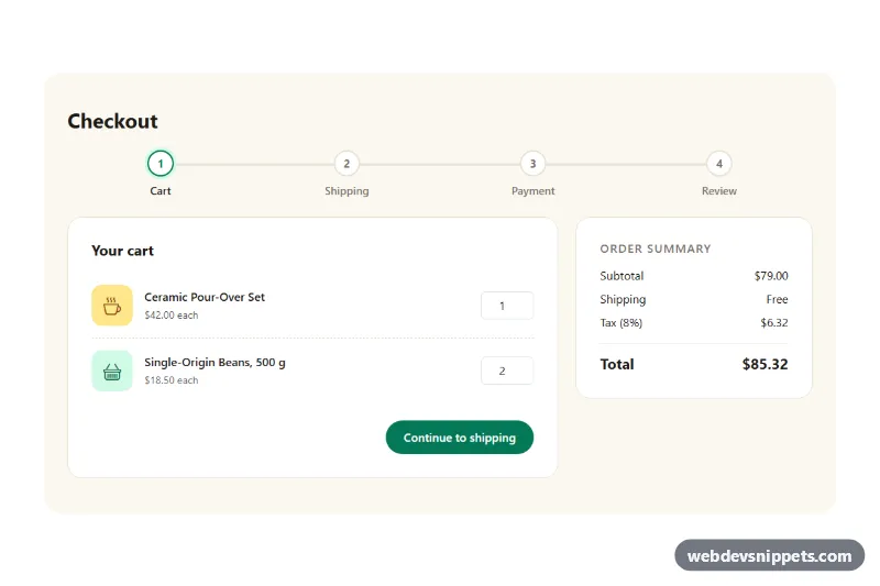
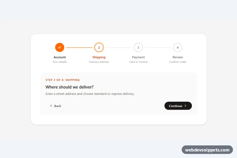
A Bootstrap 5 multi-step checkout with four steps (Cart, Shipping, Payment and Review), a numbered progress bar, Back and Continue buttons, per-step validation and a live order summary. Use it for online stores, booking flows or any form that is easier to complete in small pieces.
How it works
The root section.cs-checkout contains the ol.cs-steps progress indicator, the form.cs-form and an aside.cs-summary. Each step is a fieldset.cs-panel with a data-step number; only the current one is visible, the others carry the hidden attribute. The .cs-actions row holds .cs-btn-back and the submit button .cs-btn-next.
On DOMContentLoaded the script sets up every .cs-checkout on the page. Submitting the form validates only the visible fieldset with checkValidity(), adds Bootstrap's was-validated class to it and focuses the first invalid field. If the step is valid, show() reveals the next panel, marks earlier steps with is-done and the active one with is-current and aria-current="step", and changes the button text from the NEXT_LABELS array. Back simply returns to the previous panel; entered values are kept.
The .cs-qty inputs carry a data-price, and the selected delivery radio carries a data-cost. On every input and change event updateTotals() recalculates subtotal, shipping, tax and total in the summary. The Review step is filled from the earlier fields by fillReview(), showing only the last four card digits. The final step runs placeOrder(), which shows a spinner for 1.2 seconds and then reveals .cs-done with a random order number.
Customization
--cs-accent,--cs-accent-darkand--cs-accent-softin.cs-checkout: change the green used by the buttons, completed steps and selected delivery option.--cs-bgand--cs-linein.cs-checkout: set the cream background and the border and connector line color.TAX_RATEat the top ofscript.js: change the tax percentage; update the "Tax (8%)" label to match.NEXT_LABELSinscript.js: rename the Continue button text for each step.data-priceon each.cs-qtyanddata-coston each delivery radio: set prices; the summary updates automatically.- Add a step by adding a
fieldset.cs-panel, anli.cs-stepand a label inNEXT_LABELS, then setgrid-template-columnsin.cs-stepsto the new count. - Replace the
window.setTimeoutinplaceOrder()with afetch()call to your order or payment API.
Accessibility
The progress list has an aria-label, and the active step has aria-current="step". Each fieldset has a legend, which receives focus when the step changes, and a visually hidden role="status" region announces "Step 2 of 4: Shipping". All inputs have labels, and invalid fields show Bootstrap invalid-feedback text. Delivery options are real radio buttons, so arrow keys work. While the order is processing, the button uses aria-disabled instead of disabled so focus is not lost. Transitions are removed under prefers-reduced-motion: reduce.
Usage notes
Requires the Bootstrap 5 bundle (added automatically) and Bootstrap Icons. This is a demo: never handle real card data without a PCI-compliant payment provider. For several instances on one page, give the inputs unique ids.