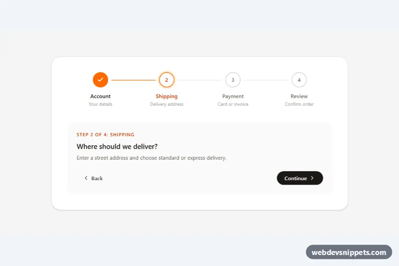
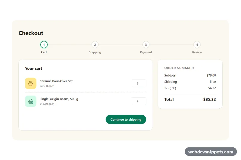
A horizontal progress stepper built with Tailwind CSS and a few lines of vanilla JavaScript. Numbered circles connected by lines show completed, current and upcoming steps, with Back and Continue buttons that move through the flow. It suits checkouts, onboarding wizards, multi-page forms and setup guides.
How it works
The root element is .tsh-stepper and its data-current attribute holds the active step (1-based). The progress bar is an ordered list; every li.tsh-step is a Tailwind group with a data-state attribute set to complete, current or upcoming. All visual states come from group-data-[state=…] variants: a completed step fills its circle orange and swaps the number for a check icon, the current step gets an orange border and a soft ring-4, and upcoming steps stay grey. Each step except the last contains a connector track with a .tsh-fill bar that scales from 0 to 100% width once the step is complete, so the line visibly "fills in" as you advance.
Below the list, a content box shows the counter (data-tsh-counter), one data-tsh-panel per step, a data-tsh-done message and the data-tsh-back / data-tsh-next buttons. On DOMContentLoaded the script initializes every .tsh-stepper, and render() updates each step's data-state, aria-current and hidden status text, shows the matching panel and enables or disables the buttons. On the last step the Continue label (data-tsh-next-label) becomes "Place order"; clicking it marks every step complete. Each change fires a bubbling tsh:change event with step, total and finished, so you can validate a form or save progress before moving on.
On phones the sub-labels are hidden and the step names shrink to text-xs, keeping all four steps on one row.
Customization
data-currenton.tsh-stepper: set the starting step, for example3to open on Payment, or5to show the finished state.orange-500,orange-700andring-orange-100in thegroup-data-[state=…]classes: replace withskyoremeraldto rebrand all states at once.h-10 w-10on the circles: useh-8 w-8for a compact bar, and changetop-5and1.75remin the connector classes to keep the lines centered.duration-500on.tsh-fill: speed up or slow down the line fill animation.- Add or remove
li.tsh-stepitems together with a matchingdata-tsh-panel; the script counts steps automatically. 'Place order'inscript.js: change the label of the final button.
Accessibility
The steps are an ol with aria-label="Checkout progress", so screen readers announce the list length. The active item carries aria-current="step", and a visually hidden data-tsh-status span appends "completed", "current step" or "not started" to each step name. The circles and connectors are aria-hidden. The counter is an aria-live="polite" region that announces "Step 3 of 4: Payment" after each move. Buttons use native disabled, focus moves to the other button when the pressed one becomes disabled, every control has a visible orange focus outline, and all transitions are switched off with motion-reduce.