
Vertical Stepper with Descriptions
Dark Tailwind CSS vertical stepper with completed, current and upcoming states, step descriptions, a progress bar and Back / Mark as complete controls.
Multi-step progress indicators for wizards and checkouts.
3 component(s)
Dark Tailwind CSS vertical stepper with completed, current and upcoming states, step descriptions, a progress bar and Back / Mark as complete controls.
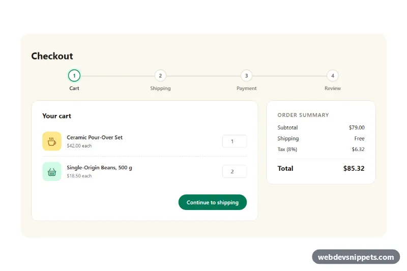
Bootstrap 5 four-step checkout with cart, shipping, payment and review steps, a progress bar, per-step validation, Back/Continue buttons and a live order summary.
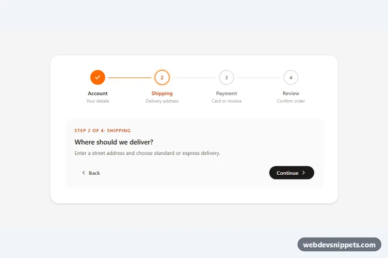
Tailwind CSS horizontal stepper with numbered circles, animated connector lines, completed/current/upcoming states and Back/Continue controls.
A stepper is a progress indicator for multi-step processes. It shows the steps of a flow, such as account details, shipping, payment and review, and highlights which step is current, which are complete and which are still ahead. Steppers are common in checkouts, onboarding wizards, booking flows, application forms and setup screens.
Use a stepper when a task is long enough to split into stages and users benefit from knowing how much is left. Three to six steps is a comfortable range. If a form is short, keep it on one page; if steps are not sequential, tabs are a better fit.
<ol>) for the steps so their sequence is clear to assistive technology.aria-current="step", and provide text such as "Completed" for finished steps instead of relying on a checkmark icon alone.Stepper snippets are available for Bootstrap 6, Bootstrap 5, Tailwind CSS and pure CSS. Bootstrap versions build on flex utilities and progress styles, with the Bootstrap 6 alpha examples using theme-* colour roles for active and completed states. Tailwind and pure CSS steppers include horizontal, vertical, numbered and icon-based layouts in plain HTML and CSS. Use the framework filter and live preview to choose a design, then copy the code from the code tabs or download it and connect it to your own form or wizard logic.