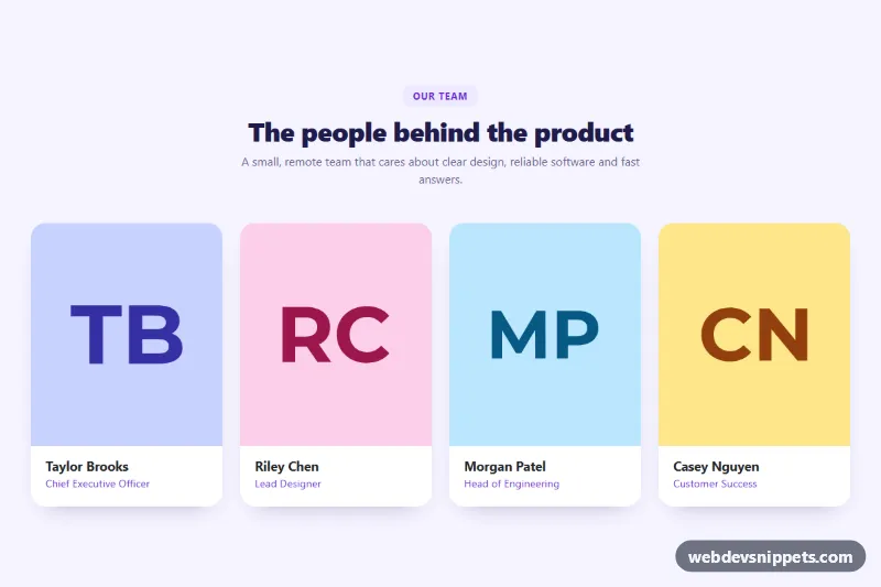
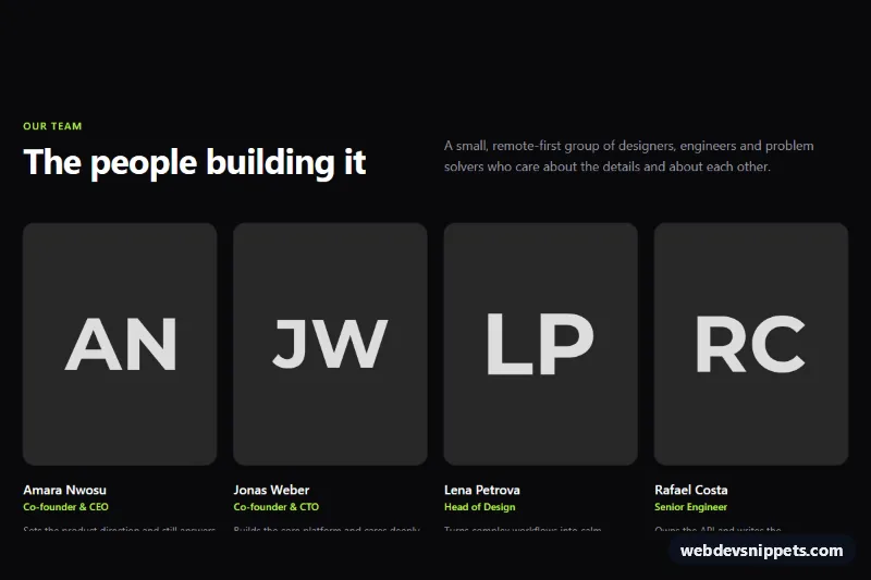
A Bootstrap 5 team section with four portrait cards that slide up a violet overlay with a short bio and social links on hover. Use it on About pages, company landing pages and agency sites to introduce the people behind a product.
How it works
The root is section.tm-team. A centered .tm-head holds the .tm-kicker label, the #tm-title heading and an intro line. The cards sit in a Bootstrap grid with row-cols-1 row-cols-sm-2 row-cols-lg-4, so the layout goes from one column on phones to two on small tablets and four on desktops.
Each card is an article.card.tm-card with two parts. .tm-media keeps a fixed aspect-ratio: 6 / 7 and contains the .tm-photo portrait plus an absolutely positioned .tm-overlay with the .tm-bio text and the .tm-social link list. Below it, .tm-body shows the .tm-name and .tm-role.
The effect is pure CSS, so there is no JavaScript. By default the overlay has opacity: 0 and is shifted down. On :hover or :focus-within, the card lifts, the photo zooms slightly and the overlay fades and slides into place. Because :focus-within is used, tabbing to a social link reveals the overlay for keyboard users. On devices with hover: none the overlay is always visible, so touch users can read the bio and tap the links.
Customization
--tm-accentin.tm-team: recolor the kicker, role text and the social icon hover color.--tm-overlay-fromand--tm-overlay-toin.tm-team: change the overlay gradient, for example to a dark neutral tint.--tm-speedin.tm-team: make the reveal animation faster or slower.--tm-radiusin.tm-team: round or square the card corners.aspect-ratio: 6 / 7in.tm-media: use1 / 1for square portraits or3 / 4for taller ones.row-cols-lg-4on the grid row: switch torow-cols-lg-3for a three-person team.- Replace the
placehold.coURLs in.tm-photowith real photos;object-fit: covercrops them cleanly.
Accessibility
Each card is an article labelled by its name heading, and the section is labelled by #tm-title. Portraits have descriptive alt text. The bio stays in the DOM, so screen readers read it even when it is visually hidden. Icon links have aria-label values such as "Taylor on LinkedIn", the icons themselves are aria-hidden, and links show a yellow focus-visible outline that stands out on the violet overlay. With prefers-reduced-motion: reduce, the lift, zoom and slide transitions are disabled.
Usage notes
Requires Bootstrap 5 and Bootstrap Icons. Replace the # link targets with real profile URLs, and make the heading ids (tm-name-1 and so on) unique if you repeat the section on one page.