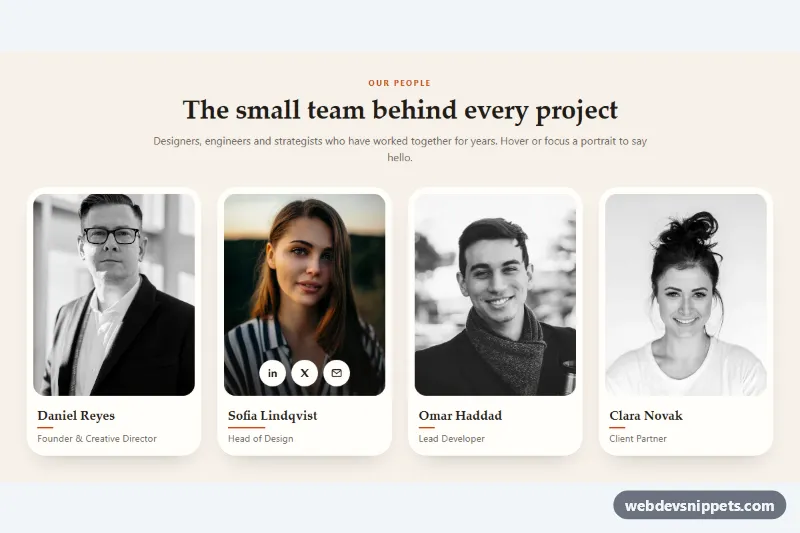
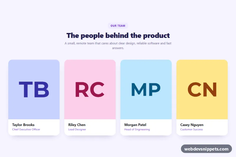
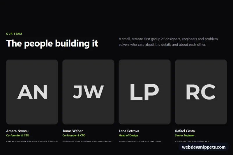
A warm, editorial team section built with pure CSS: four portrait cards start in black and white and fade into full color when you hover or focus them, while a row of round social links slides up over the photo. It fits agency, studio and startup about pages where you want the team to feel calm and consistent until a visitor shows interest in one person.
How it works
The root section.tgp-team contains a .tgp-header (eyebrow, title and intro) and a ul.tgp-grid of li.tgp-card items. Each card has a .tgp-photo box with a fixed aspect-ratio: 4 / 5, the portrait img with object-fit: cover, and a ul.tgp-social list of three .tgp-social-link icons, followed by the .tgp-name heading and .tgp-role.
The grayscale effect is a single custom property. The image uses filter: grayscale(var(--tgp-gray)), and --tgp-gray switches from 1 to 0 on .tgp-card:hover, on :focus-within and on the default .is-active card. The same states scale the photo by --tgp-zoom, fade in a dark gradient (.tgp-photo::after) for icon contrast, slide .tgp-social up into view and widen the accent line under .tgp-name.
The second card carries is-active so the first view (and the page thumbnail) shows the effect. As soon as the pointer enters the grid or another card receives focus, rules based on .tgp-grid:hover and .tgp-grid:has(.tgp-card:focus-within) return that card to grayscale, so only one person is highlighted at a time. On touch screens (hover: none) photos are shown in color and the links stay visible. No JavaScript is needed.
Customization
--tgp-accenton.tgp-team: the terracotta color of the eyebrow, the line under each name and the social link hover state.--tgp-bgand--tgp-card: page background and card background.--tgp-speed: duration of the color fade and the slide, e.g.0.3sfor a quicker reveal.--tgp-zoom: zoom of the photo in the revealed state; set it to1to disable the zoom.--tgp-radius: the photo corner radius (the card radius follows it).- Move
is-activeto another.tgp-card, or remove it, to change which portrait is in color on load. aspect-ratioon.tgp-photo: use1 / 1for square portraits.grid-template-columnsin the.tgp-gridmedia queries: one column on phones, two from 540px, four from 960px.
Accessibility
The section is labelled by its heading, and every portrait has a descriptive alt text with the person's name. Social links are real anchors with an aria-label such as "Sofia on LinkedIn", and each list has its own label. Because the reveal also reacts to :focus-within, keyboard users see the links appear when they Tab into a card, and every link shows an accent outline. With prefers-reduced-motion: reduce the transitions and the zoom are switched off; the color change still happens instantly.
Usage notes
The portraits come from Unsplash; replace them with your own team photos, ideally cropped to the same 4:5 ratio. The :has() rule needs a current browser; older browsers simply keep the default card in color while another card is focused.