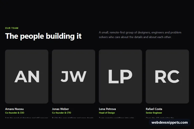
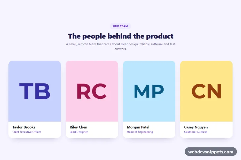
A dark team section built with Tailwind CSS that introduces team members with a portrait, name, role, a one-line bio and social profile links, closed by a dashed "We are hiring" card. It fits About pages, company sites, agency portfolios and startup landing pages.
How it works
The root is section.tm-team on a bg-zinc-950 background with a lime accent. The header is a two-column grid on large screens: the eyebrow and #tm-title heading sit on the left and the intro paragraph aligns to the right.
Members live in a ul with role="list" that shows one column on phones, two at sm:grid-cols-2 and four at lg:grid-cols-4. Each li.tm-member is a Tailwind group. Its .tm-photo wrapper clips an img with a fixed aspect-[4/5] ratio and object-cover, so portraits of any size crop consistently. The photos start in grayscale; hovering the card triggers group-hover:grayscale-0 and group-hover:scale-105, bringing the portrait to full color with a gentle zoom. Below the photo come the h3 name, the role in text-lime-300, a short bio and a row of round .tm-social icon links (X, GitHub, LinkedIn, Dribbble) drawn with inline SVG.
The last item, li.tm-hiring, is a full-height dashed card linking to open roles, which keeps the grid balanced at eight cells. The section needs no JavaScript and no custom CSS file.
Customization
srcon eachimg: replace thehttps://placehold.co/480x600/...placeholders with real portraits; keepwidth,heightand descriptivealttext.aspect-[4/5]on the images: change toaspect-squarefor square headshots oraspect-[3/4]for taller portraits.- Remove
grayscaleandgroup-hover:grayscale-0from the images to show color photos at all times. lg:grid-cols-4on the members list: uselg:grid-cols-3for larger cards, orxl:grid-cols-5for a big team.text-lime-300,hover:bg-lime-300on.tm-socialandbg-lime-300in.tm-hiring: swap for another color such assky-300to change the accent.- Delete
li.tm-hiringif you have no open positions, or point itshrefto your careers page. bg-zinc-950on.tm-teamandbg-zinc-800on.tm-social: lighten both for a less dramatic dark tone.
Accessibility
The section is labelled by aria-labelledby="tm-title", members use h3 headings under the h2, and lists use role="list" so they keep their semantics with list styles removed. Every icon-only social link has an aria-label such as "Jonas Weber on GitHub", and each social list has its own label, so screen reader users know whose profiles they are visiting; the SVGs are aria-hidden. Portraits carry alt text with the person's name. All links show a lime focus-visible:outline-2 ring with an offset, and zinc-400 body text on zinc-950 passes WCAG AA. The zoom and color transitions use motion-reduce:transition-none for users who prefer reduced motion.
Usage notes
Requires the Tailwind browser build (added automatically). The loading="lazy" attribute keeps long team pages fast. Because there is no script, the section can be repeated freely; give each copy a unique heading id.