
Team Cards with Grayscale to Color Photo Hover
Pure CSS team section where grayscale portraits turn to full color, zoom in slightly and reveal social links on hover or keyboard focus.
Introduce team members with photos and roles.
3 component(s)
Pure CSS team section where grayscale portraits turn to full color, zoom in slightly and reveal social links on hover or keyboard focus.
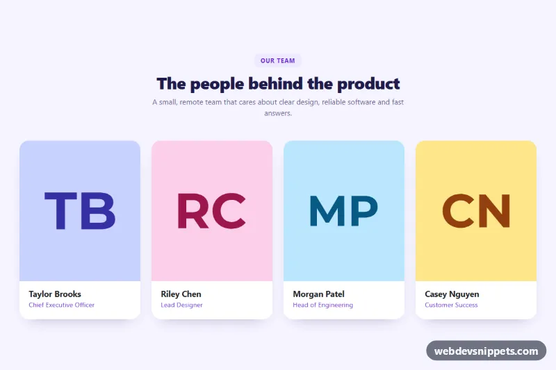
Bootstrap 5 team section with portrait cards that reveal a bio and social links on hover or keyboard focus. Pure CSS, no JavaScript.
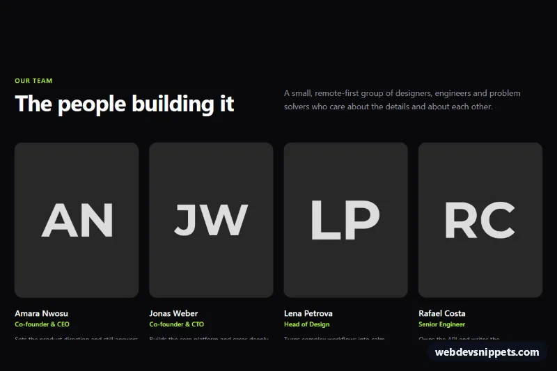
Dark Tailwind CSS team section with portrait photos, roles, short bios, accessible social links and a hiring card.
A team section introduces the people behind a company, project or organisation. Each member is usually shown with a photo, name and role, often with a short bio and links to social profiles. Typical layouts are photo grids, cards with hover overlays, compact lists and featured leadership rows. Team sections are used on about pages, agency sites, startup landing pages and event pages for speakers.
Add one when the people are part of the value: agencies, consultancies, clinics, law firms and small businesses benefit most. For large organisations, show leadership or department heads and link to a full team page.
object-fit: cover keeps portraits aligned.alt text with the person's name, or leave it empty when the name is shown directly below.aria-label="Anna on LinkedIn".The team section examples are available for Bootstrap 6, Bootstrap 5, Tailwind CSS and pure CSS. Bootstrap versions use the grid, cards and image utilities, and Bootstrap 6 variants adopt the theme-* colour roles for accents and overlays. Tailwind CSS versions use only utility classes, and pure CSS versions rely on CSS Grid with custom properties for spacing and colour. Filter by framework, review each layout in the live preview, and copy the HTML and CSS from the code tabs or download the snippet. Replace the placeholder photos, names and roles and you have a responsive team grid for your about page.