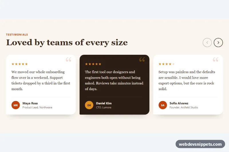
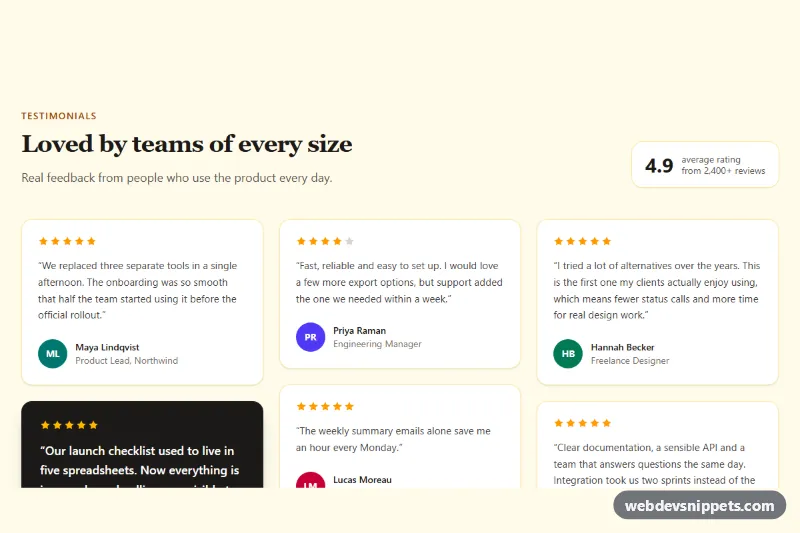
A Bootstrap 5 testimonial carousel that rotates customer quotes in a single warm, serif-styled card with pill indicators, round arrow buttons and a pause control. Use it on landing pages, pricing pages or anywhere one quote at a time should get full attention.
How it works
The root is section.tq-section. Inside it, #tq-carousel is a standard Bootstrap carousel slide with the extra class tq-carousel, which caps its width through --tq-max-width. Each carousel-item contains a figure.tq-slide: an inline SVG quote mark (.tq-mark) that overlaps the top edge, a blockquote.tq-quote and a figcaption.tq-author with an initials avatar (.tq-avatar, plus the --alt and --dark color modifiers), name and role.
Below the slides, .tq-controls is a flex row with the previous button, the .tq-indicators and the next button, all driven by Bootstrap's data-bs-slide and data-bs-slide-to attributes. The CSS moves .carousel-indicators out of its usual absolute position and turns the active dot into a wide accent pill.
The script handles the .tq-pause button. Bootstrap restarts the cycle after hover and indicator clicks, so setPaused() disposes the instance and creates a new one with either { ride: false, interval: false } or the original interval. Rotation also pauses while keyboard focus is inside the carousel and resumes on focusout. Without JavaScript from this file the carousel still works with Bootstrap's own data API.
Customization
data-bs-interval="7000"on#tq-carousel: change the time each quote stays visible, in milliseconds; the script reads the same value when resuming.--tq-accentand--tq-accent-softin.tq-section: recolor the quote badge, kicker, active indicator, hover state and avatar.--tq-bgand--tq-cardin.tq-section: change the section background and the card color.--tq-quote-fontin.tq-section: switch the heading and quote typeface, for example to a sans-serif stack.--tq-max-widthin.tq-section: make the card wider or narrower.border-radius: 2rem 2rem 2rem 0.5remin.tq-slide: change the speech-bubble corner shape.- Add
carousel-fadenext toslideon#tq-carouselto cross-fade instead of sliding.
Accessibility
The carousel uses aria-roledescription="carousel" and each slide is a group with aria-roledescription="slide" and a "1 of 3" label. Arrow and indicator buttons have descriptive aria-label values, and the active indicator gets aria-current. The pause button uses aria-pressed and updates its label. While paused, .carousel-inner becomes a polite live region so manual slide changes are announced. Users who prefer reduced motion start in the paused state, and Bootstrap already removes the slide transition for them. All buttons show a clear focus-visible outline.
Usage notes
Requires Bootstrap 5 and Bootstrap Icons. For a second carousel on the same page, give it a new id and update every data-bs-target.