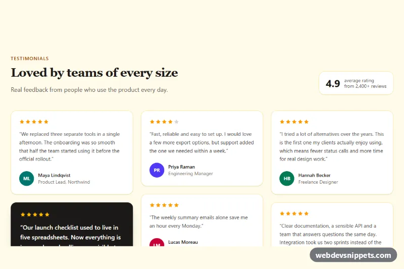
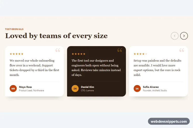
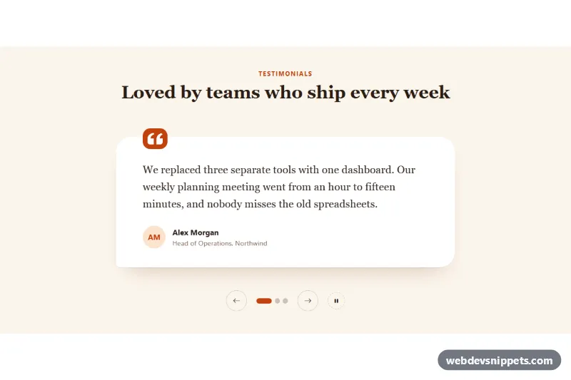
A masonry-style testimonials section built with Tailwind CSS, showing customer quotes in cards of different heights with star ratings, initial avatars, names and roles. A "Show more reviews" button reveals extra quotes on demand. Use it on landing pages, pricing pages or anywhere social proof helps visitors decide.
How it works
The root is section.tg-testimonials on a warm bg-amber-50 background. The header pairs the #tg-title heading with a summary badge showing the average rating.
The masonry effect comes from CSS multi-column layout rather than JavaScript. The wrapper div.tg-grid uses columns-1 sm:columns-2 lg:columns-3, and every card has break-inside-avoid and mb-6, so cards of any height flow top to bottom and never split across columns. Each card is a figure.tg-card containing a star row, a blockquote and a figcaption with a colored initials avatar. One card is styled as a dark bg-stone-900 highlight to break the rhythm and draw the eye.
Three extra cards carry data-tg-extra and the hidden attribute. On DOMContentLoaded the script finds every .tg-testimonials root and listens for clicks on button.tg-more. A click toggles hidden on the extra cards, adds .tg-card--in for a short fade-and-rise animation, flips aria-expanded, swaps the [data-tg-label] text between "Show more reviews" and "Show fewer reviews", and rotates .tg-chevron via .tg-more--open. Without JavaScript the first six reviews still display normally.
Customization
lg:columns-3on.tg-grid: change tolg:columns-4for a denser wall of quotes, orlg:columns-2for wider cards.data-tg-extrawithhiddenandtabindex="-1": add these to anyfigure.tg-cardto move it behind the "Show more" button; if no card hasdata-tg-extra, the script hides the button.--tg-reveal-durationinstyle.css: lengthen or shorten the fade-in of revealed reviews.aria-label="Rated 5 out of 5"on each star row: update it together with the star colors (text-amber-500for filled,text-stone-300for empty) when a rating changes.bg-stone-900card: move these classes to anotherfigureto highlight a different quote, or replace them with the white card classes for a uniform grid.- Avatar
spanwithbg-teal-700and initials: swap for animgfromhttps://placehold.co/88x88or your own photos withrounded-full. bg-amber-50on the section andborder-amber-200/70on cards: change both for a new palette.
Accessibility
Each quote uses figure, blockquote and figcaption, the semantic pattern for attributed quotations. Star rows have role="img" with an aria-label such as "Rated 4 out of 5", while the individual stars and avatars are aria-hidden. The toggle button uses aria-expanded and aria-controls, an aria-live="polite" status in [data-tg-status] announces the change, and focus moves to the first revealed review so keyboard users keep their place. Focus rings use focus-visible:outline-2, and the reveal animation and chevron rotation are disabled under prefers-reduced-motion: reduce.
Usage notes
Requires the Tailwind browser build (added automatically). Several sections can share a page because the script scopes all queries to each .tg-testimonials; give each copy unique tg-title and tg-list ids and update aria-controls.