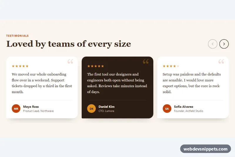
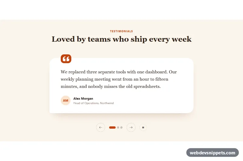
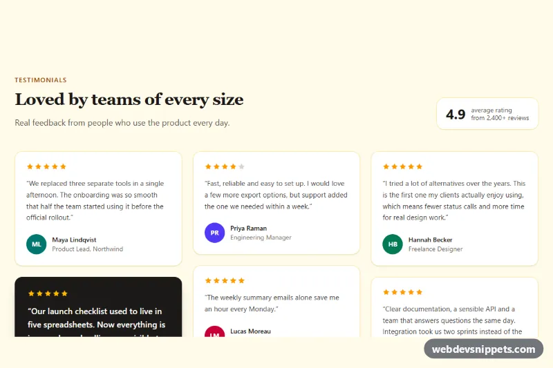
A horizontally scrolling testimonial slider built with native CSS scroll snap and a few lines of vanilla JavaScript for the previous and next buttons. Warm serif quote cards with star ratings and initials avatars make it a good fit for landing pages, pricing pages and case-study sections.
How it works
The root section.ts-slider holds a .ts-head with the heading and the .ts-controls buttons, followed by the ul.ts-track list. Each li.ts-slide contains a figure.ts-card with a .ts-stars rating, a blockquote.ts-quote and a figcaption.ts-author with a .ts-avatar, .ts-name and .ts-role.
The track is a CSS grid with grid-auto-flow: column, so slides line up in one row and overflow horizontally. scroll-snap-type: x mandatory on the track and scroll-snap-align: start on every slide make each swipe, trackpad gesture or arrow-key scroll settle on a card edge. The column width is calculated from --ts-per-view and --ts-gap: a little more than one card on phones, two from 700px and three from 1024px.
On DOMContentLoaded the script initializes every .ts-slider, reveals the hidden .ts-controls and listens for click on .ts-prev and .ts-next. Each click calls scrollBy() with the width of one slide plus the gap. A scroll listener, throttled with requestAnimationFrame, disables the previous button at the start and the next button at the end. Without JavaScript the buttons stay hidden and the track still scrolls and snaps natively.
Customization
--ts-per-viewon.ts-slider: how many cards are visible; it is set to2and3in the 700px and 1024px media queries, and fractional values such as1.15show a peek of the next card.--ts-gap: space between cards, also used in the column width calculation.--ts-accent: the kicker text, avatar background, decorative quote mark, scrollbar and focus outline.--ts-bg,--ts-cardand--ts-dark: section background, light card and dark card colors.- Add
.ts-card--darkto anyfigure.ts-cardto switch it to the dark brown style. --ts-radius: corner radius of the cards; the bottom-left corner stays nearly square on purpose.- Wrap the last star in
.ts-star-offand update thearia-labelon.ts-starsto show a 4-star rating.
Accessibility
The section is labelled by its heading and has aria-roledescription="carousel". Slides stay a real list, so screen readers announce the number of testimonials. The track has tabindex="0" and an aria-label, so keyboard users can focus it and scroll with the arrow keys. The buttons have aria-label and aria-controls, become disabled at the ends, and focus moves to the other button before one is disabled. Ratings use role="img" with a text label instead of reading out star characters, and avatars are aria-hidden. With prefers-reduced-motion: reduce scrolling jumps instead of animating. Every interactive element has a visible :focus-visible outline.
Usage notes
For several sliders on one page, give each .ts-track a unique id and update aria-controls on its buttons. The quote text uses a serif stack; swap the font-family on .ts-slider for your brand font.