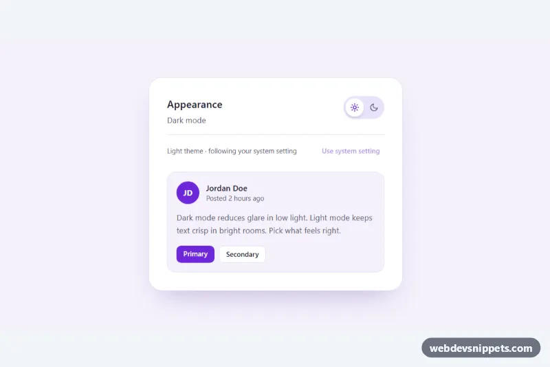
A light/dark theme toggle built with Tailwind CSS and vanilla JavaScript. It starts from the visitor's operating system preference, lets them override it with an animated sun/moon switch, remembers the choice in localStorage, and offers a one-click way back to the system setting. A small preview card shows the theme change live, which makes it a good fit for settings pages, dashboards and blog headers.
How it works
The root .ttg-root defines all colors as CSS custom properties in style.css, and the markup uses them through arbitrary-value utilities such as bg-[var(--ttg-bg)] and text-[var(--ttg-muted)]. Adding the ttg-dark class to the root swaps the whole token set, so every element inside changes at once.
The switch is a button with role="switch" marked data-ttg-switch. Its .ttg-knob slides with transform when aria-checked="true", while .ttg-knob-sun and .ttg-knob-moon cross-fade and rotate. On DOMContentLoaded the script reads the key named in data-ttg-storage; if nothing is stored it uses matchMedia('(prefers-color-scheme: dark)'). Clicking the switch stores dark or light, and the data-ttg-reset button removes the stored value so the component follows the system again (it is disabled while nothing is stored). The script also listens to the media query change event, to the storage event for other tabs, and to a ttg:sync event so several toggles on one page stay in step. Every change fires a bubbling ttg:change event with detail.theme. The ttg-ready class turns on transitions after the first paint so the page does not animate on load. If storage is blocked, the choice is kept in memory for the session.
Customization
data-ttg-scopeon.ttg-root: set it todocumentto also toggle adarkclass andcolor-schemeon<html>, so the rest of your site can react to the theme.data-ttg-storage: change thelocalStoragekey, for example to share one preference across several apps on the same domain.--ttg-accentand--ttg-on-accentin both the.ttg-rootand.ttg-root.ttg-darkblocks: the violet accent of the knob icon, avatar and primary button.--ttg-bg,--ttg-surface,--ttg-textand--ttg-border: page, card, text and border colors for each theme.--ttg-speed: duration of the color fade and knob slide.translateX(2rem)on.ttg-switch[aria-checked="true"] .ttg-knob: adjust it if you resize thew-[4.5rem]track.- Listen for
ttg:changeon the root to sync the theme with a charting library or a server-side preference.
Accessibility
The control is a native button with role="switch" and aria-checked, labelled by the visible "Dark mode" text and described by the status line, so screen readers announce "Dark mode, switch, on". Space and Enter toggle it. The status message (data-ttg-status) is an aria-live region that explains whether the theme is saved or follows the system. Icons are aria-hidden. Both themes meet WCAG AA text contrast, focus rings use the accent color, and all transitions are disabled under prefers-reduced-motion: reduce.
Usage notes
To avoid a flash of the wrong theme on full sites, also add a tiny inline script in your <head> that reads the same storage key before the page renders.