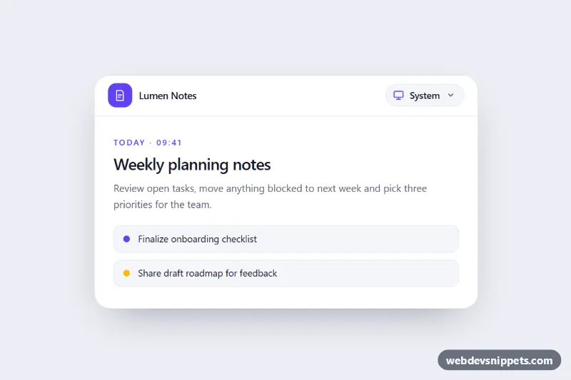
System, Light and Dark Theme Dropdown
Accessible Tailwind CSS dropdown to choose a light, dark or system theme, with live OS sync, saved preference and CSS variable tokens.
Light and dark mode switches.
2 component(s)
Accessible Tailwind CSS dropdown to choose a light, dark or system theme, with live OS sync, saved preference and CSS variable tokens.
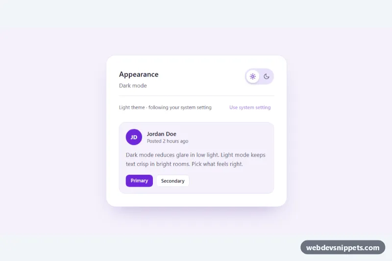
Tailwind CSS dark mode toggle with an animated sun/moon switch that follows the system preference, remembers the choice and can reset to system.
A theme toggle is a switch that lets visitors change between light and dark mode, and sometimes a third "system" option. It often shows a sun and moon icon, a sliding switch or a small dropdown. Theme toggles are common in documentation sites, dashboards, blogs and developer tools where people read for long periods.
Add a toggle when your site supports both colour schemes and you want users to override their operating system preference. If you only follow prefers-color-scheme automatically, a toggle is optional, but many users appreciate the choice.
Best practices for a light and dark mode switch:
<button> with aria-pressed, or a checkbox or radio group with a visible or screen-reader label, so the current state is announced.localStorage and apply it before the page renders, with a tiny inline script in the <head>, to avoid a flash of the wrong theme.prefers-color-scheme when no choice is stored, and offer a "system" option if possible.data-theme or data-bs-theme on the <html> element and drive colours with CSS custom properties.prefers-reduced-motion.Every theme toggle has a live preview and code tabs for HTML, CSS and JS. Bootstrap 6 versions build on the new alpha ES module build and its theme-* colour roles, which makes switching schemes a matter of changing one attribute. Bootstrap 5 versions use data-bs-theme, Tailwind CSS versions work with the dark: variant and a class or attribute strategy, and pure CSS versions use custom properties. Filter by framework, copy or download the toggle, and connect it to your own colour tokens.