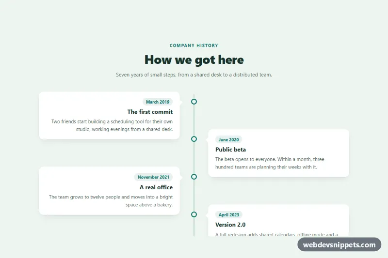
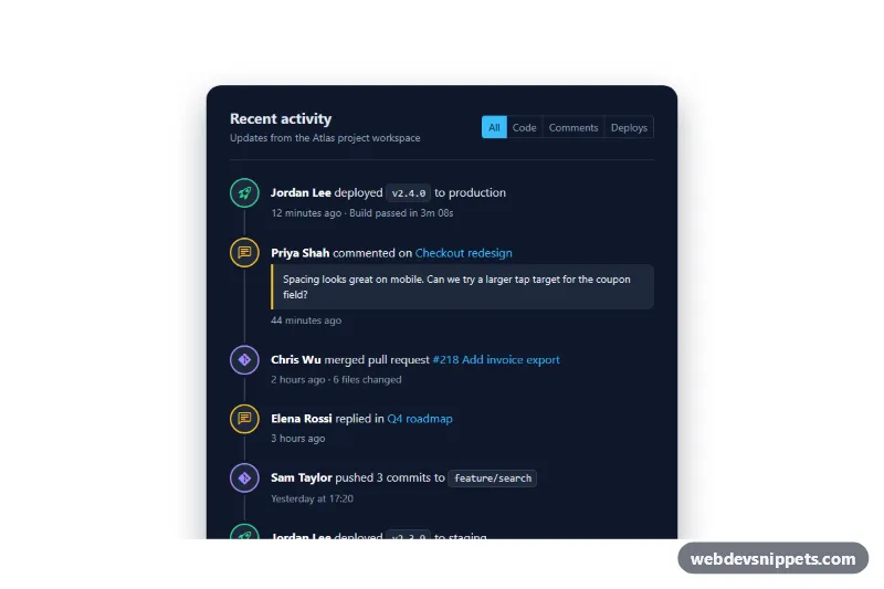
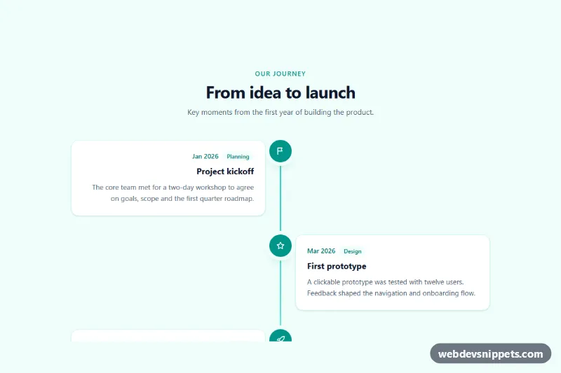
An alternating vertical timeline in pure CSS: a center line runs down the page and the entries switch between the left and right side, each with a dot on the line and a small arrow pointing to it. It fits company history pages, product roadmaps, project milestones and resumes, and needs no JavaScript.
How it works
The root section.tla-section holds a centered .tla-header and an ordered list, ol.tla-list, because the entries follow a sequence. Every li.tla-item wraps an article.tla-card with a time.tla-date pill, an h3.tla-title and a p.tla-text.
The vertical line is the ::before pseudo-element of .tla-list, and each dot is the ::before of a .tla-item. The arrow is a CSS border triangle on .tla-card::before, colored like the card so it looks like part of it.
The layout is mobile first. On small screens the line sits on the left, the list is indented by --tla-gap and every card points left. From 768px the line moves to left: 50%, each item takes half the width, and :nth-child(even) items get margin-left: 50%, so entries alternate sides. Odd items are right-aligned, their dot sits on the right edge and their arrow is flipped to point right. From 1024px each item gets a negative top margin so the two columns interlock and the timeline feels tighter. The .tla-item--current modifier fills the dot, adds a soft halo and outlines the card to mark the present step.
Customization
--tla-accenton.tla-section: color of the dots, date pills, kicker text and the current-step outline.--tla-lineand--tla-line-width: color and thickness of the center line.--tla-dot: diameter of the dots on the line.--tla-gap: distance between the line and the cards, on mobile and desktop.--tla-arrow: size of the triangle pointing from each card to the line; set it to0to hide it.--tla-bgand--tla-card-bg: page and card backgrounds. The arrow follows--tla-card-bgautomatically.- Move
.tla-item--current(andaria-current="step") to anotherlito highlight a different milestone. - The
margin-top: -2.5remrule in the 1024px media query controls how much the columns overlap; remove it for a strictly stacked layout.
Accessibility
The entries are an ordered list, so screen readers announce their number and position, and the reading order stays chronological on every screen size because only CSS moves the items. Each entry is an article with its own heading, which makes the timeline easy to navigate by headings. Dates use time elements with machine-readable datetime values. The current milestone carries aria-current="step", so it is not marked by color alone. The line, dots and arrows are pseudo-elements and are ignored by assistive technology. The timeline has no animation, so there is nothing to disable for prefers-reduced-motion, and the muted text keeps good contrast on the white cards.
Usage notes
Add more entries by copying a li.tla-item; the alternation follows :nth-child, so no extra classes are needed. Keep the cards of similar length on desktop for the most even rhythm.