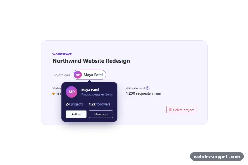
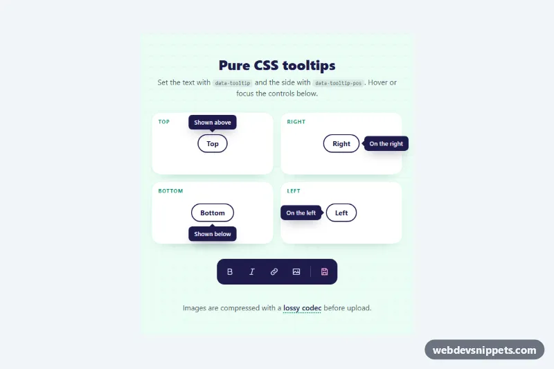
A set of Bootstrap 5 popovers with rich HTML content: a profile card with Follow and Message buttons, a help popover with a list and a link, and a delete confirmation with Cancel and Delete actions. Use the pattern for user previews, inline help next to form fields or lightweight confirmations that do not need a full modal.
How it works
The root .rp-demo wraps a small project card and three <template data-rp-template="…"> elements. Each .rp-trigger button names the template it uses in data-rp-template and its position in data-bs-placement; the help and confirm triggers also set a header with data-bs-title.
The script runs on DOMContentLoaded for every .rp-demo and creates each popover with bootstrap.Popover.getOrCreateInstance(), passing html: true, trigger: 'click', container: root and a custom template whose root has role="dialog". The content option returns a fresh clone of the matching <template>, so real DOM nodes (including buttons that Bootstrap's string sanitizer would strip) are inserted on every opening.
On show.bs.popover other open popovers in the same component are hidden. On shown.bs.popover the script sets aria-expanded, links the header with aria-labelledby, moves focus to the first button or link, and wires up the content: data-rp-action="follow" toggles aria-pressed and the label, message, delete and close write to the .rp-status line and close the popover. Escape, a click outside or tabbing out also closes it. The trigger with data-rp-open is opened on load without moving focus, so the preview shows a popover straight away.
Customization
--rp-pop-bg,--rp-pop-textand--rp-pop-mutedon.rp-demoinstyle.css: recolour the popover surface, body text and secondary text.--bs-popover-max-width: 300pxin.rp-popover: allow wider popovers for longer content.--rp-radiuson.rp-demo: changes the corner radius of every popover.data-bs-placementon a.rp-trigger: usetop,right,bottomorleft; Popper flips it when space runs out.- Add a new popover: create a
<template data-rp-template="name">and a button withclass="rp-trigger"anddata-rp-template="name". - Remove
data-rp-openfrom the Maya Patel button so no popover is open on page load. - The
deletebranch in thetipclick handler inscript.js: replace the status message with afetch()call to your backend.
Accessibility
Popovers use role="dialog" and are labelled by their header or by the trigger text. Triggers carry aria-haspopup="dialog" and an aria-expanded state that follows the popover. Focus moves into the popover when it is opened by the user and returns to the trigger after Escape or an action. The Follow button reports its state with aria-pressed, the icon-only help button has an aria-label, and results are announced through the role="status" paragraph. Focus rings use :focus-visible, and the fade transition is disabled under prefers-reduced-motion.
Usage notes
Requires Bootstrap 5 (added automatically) and Bootstrap Icons. Because templates are found inside each .rp-demo, several instances can share the same template names on one page.