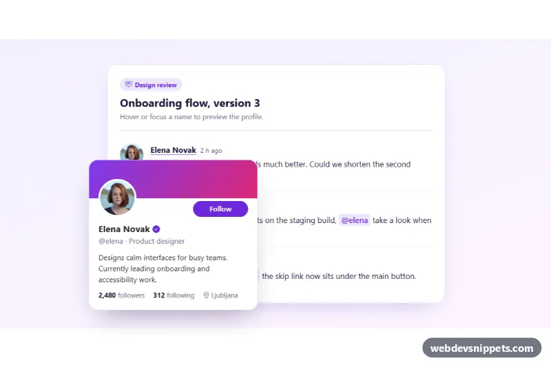
User Hover Card Popover with Photo
Bootstrap 5 popover hover card showing a user photo, cover band, bio, follower stats and a working follow button.
Contextual hints and floating panels.
3 component(s)
Bootstrap 5 popover hover card showing a user photo, cover band, bio, follower stats and a working follow button.
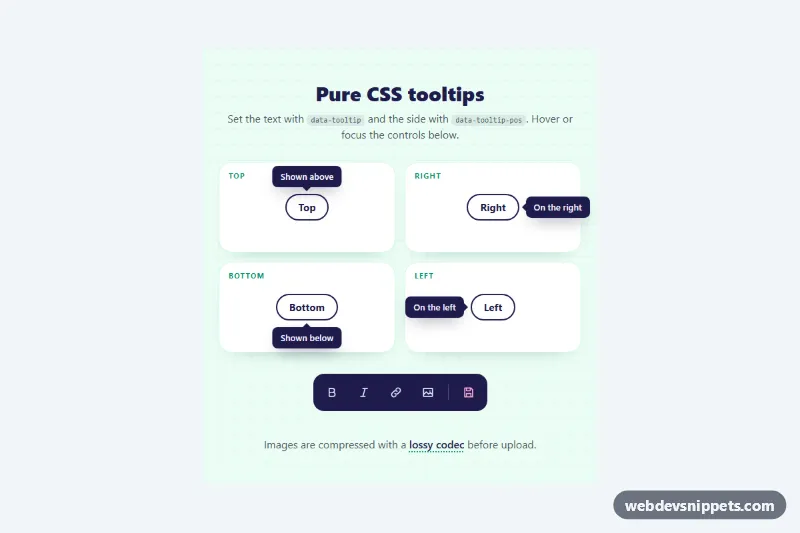
JavaScript-free tooltips driven by data attributes, with top, right, bottom and left placement, arrows, color tones and hover or focus triggers.
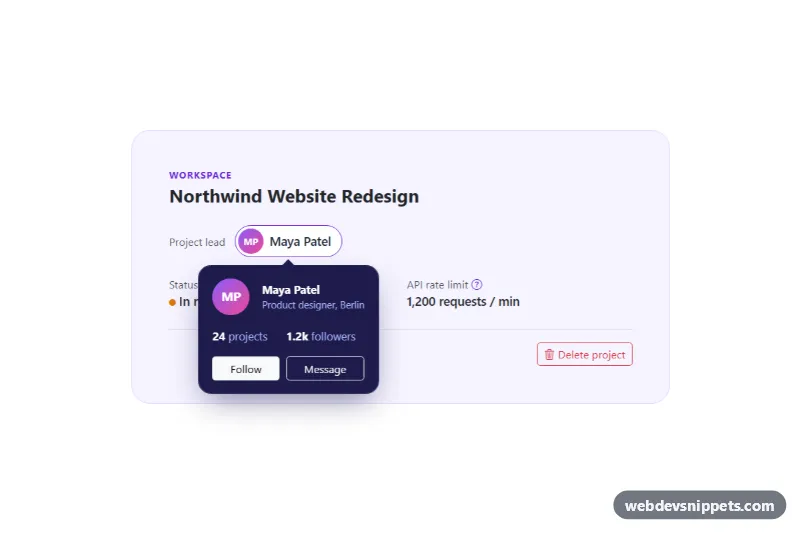
Bootstrap 5 popovers with HTML content: profile card with buttons, inline help with links and a delete confirmation, with focus handling.
A tooltip is a small text label that appears when the user hovers over or focuses an element, explaining what an icon or control does. A popover is a larger floating panel attached to a trigger, which can contain a title, formatted text, links or even small forms, and usually opens on click. Both are used to give contextual help without cluttering the interface: icon descriptions in toolbars, field hints in forms, user previews and quick settings.
Tooltips must appear on keyboard focus as well as hover, stay visible while the pointer moves onto them, and close with Escape. Connect the tooltip to its trigger with aria-describedby and give it role="tooltip". Popovers that contain interactive content behave like non-modal dialogs: the trigger should have aria-expanded, focus should move into the popover, and closing it should return focus to the trigger. The native popover attribute in modern browsers handles light dismiss and top-layer stacking without extra JavaScript.
These bootstrap tooltip examples and CSS popover snippets come in Bootstrap 6, Bootstrap 5, Tailwind CSS and pure CSS. Bootstrap 5 versions require initialising tooltips and popovers in JavaScript; Bootstrap 6 versions use the new ES module build. Pure CSS versions show tooltips with :hover and :focus-visible, and some examples use the native popover attribute. Test them in the live preview, then copy the code from the code tabs or download it.