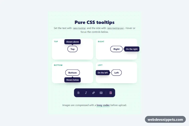
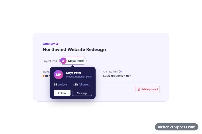
Lightweight tooltips made with pure CSS and no JavaScript at all. Add a class and a data-tooltip attribute to any button, link or text and a small bubble with an arrow appears on hover and keyboard focus, on the top, right, bottom or left side. They suit icon toolbars, form hints, glossary terms and compact dashboards.
How it works
Every tooltip is two pseudo-elements on the element with .tt-tip. ::after prints the text with content: attr(data-tooltip), and ::before draws the arrow as a zero-size box with one colored border. Both are absolutely positioned against the element (.tt-tip sets position: relative) and start with opacity: 0 and visibility: hidden.
The side is chosen with data-tooltip-pos. Top is the default; bottom, left and right move the bubble and switch which border of the arrow gets the color. Each side also sets two custom properties, --tt-hide and --tt-show, which hold the transform before and after showing, so the bubble slides a few pixels toward its final spot as it fades in.
The bubble appears on :hover, on :focus-visible, or permanently when the element has the data-tooltip-open attribute. The demo uses that attribute on the four direction tiles so every side is visible at once, while the dark .tt-toolbar and the inline .tt-term show the usual hover and focus behaviour. The text wraps automatically once it reaches --tt-max-width.
Customization
data-tooltipon any.tt-tipelement: the tooltip text.data-tooltip-pos="top|right|bottom|left": the side where the bubble appears.data-tooltip-tone="light"or"accent": a white bubble with dark text, or a pink accent bubble; add your own tone by setting--tt-bgand--tt-color.--tt-bgand--tt-coloron.tt-tip: default bubble and text colors for all tooltips.--tt-offsetand--tt-arrow: the gap between element and bubble, and the arrow size.--tt-max-width: the width at which long text starts to wrap.--tt-delayand--tt-speed: the hover delay before showing and the fade duration.data-tooltip-open: remove it from the four.tt-btnbuttons to make them hover-only like the rest.
Accessibility
Text in pseudo-elements is not reliably announced by screen readers, so the tooltip must never be the only source of information. The icon buttons in the toolbar carry an aria-label with the same text, and the glossary term uses aria-describedby pointing to a visually hidden .tt-sr span. Tooltips open on :focus-visible, so keyboard users see the same hints as mouse users, and the focusable term has tabindex="0". All controls show a pink focus outline. With prefers-reduced-motion: reduce the slide and delay are removed.
Usage notes
Because the tooltip is part of the element, a parent with overflow: hidden will clip it; .tt-demo uses overflow-x: clip only to stop hidden bubbles from causing sideways scrolling on phones. Pseudo-elements cannot be dismissed with Escape; if you need that, add a small script that toggles a class. Elements such as input and img cannot have pseudo-elements, so wrap them in a span.tt-tip.