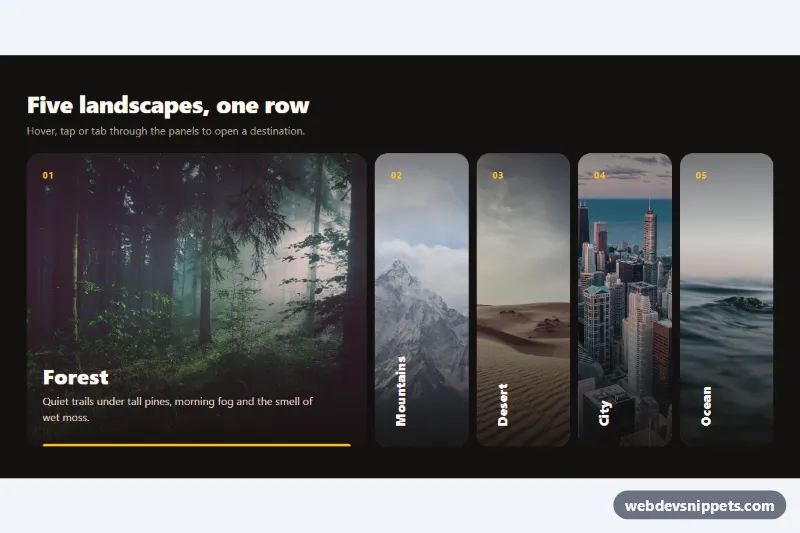
A horizontal image accordion in pure CSS with an optional dash of JavaScript: five photo panels sit in a row, and the one you hover, focus or tap stretches open to reveal its title and a short description, while the others shrink into slim strips with vertical labels. It works well for destination pickers, portfolio categories and feature showcases.
How it works
The root section.ha-gallery contains a heading and the ul.ha-list. Each li.ha-panel holds an img.ha-img, a .ha-link with the .ha-num and .ha-title, and a .ha-text paragraph. The link's ::after is stretched over the whole panel, so the entire photo is clickable.
All motion is driven by one registered custom property, --ha-o, declared with @property as a number. It is 0 for a closed panel and 1 for an open one, and every visual value is calculated from it: the flex grow factor, the image zoom and saturation, the title size and rotation, the text height and opacity, and the accent bar. Because the property is registered, transition: --ha-o animates all of them together.
A panel is open when it has .ha-panel--open (the default, so the first-load state is never empty), on :hover or on :focus-within. A :has() rule closes the default panel while another one is hovered or focused. The script is a progressive enhancement: on pointerenter (mouse), focusin and click it moves .ha-panel--open, so the last chosen panel stays open, and the first tap on a closed panel opens it instead of following the link.
Customization
--ha-growon.ha-gallery: how much wider the open panel gets than a closed one.--ha-height: height of the row on screens from 720px.--ha-speed: duration of the open and close animation.--ha-accent: color of the numbers, the accent bar and the focus ring.--ha-turn: rotation of closed titles on desktop; set it to0degfor horizontal labels.- Move
.ha-panel--opento anotherlito open a different panel on load. - Change the
srcof each.ha-img. The photos come from Unsplash and should be replaced with your own images.
Use cases
- Travel sites: destination photos expand on hover to show a title and short description
- Portfolios: category panels with vertical labels open to reveal each work type
- Feature showcases: five panels let visitors explore options in a compact row
- Touch devices: the first tap opens a panel and the second follows the link
- Mobile layouts: panels stack vertically and expand in height on small screens
Accessibility
The list keeps native list semantics, and each panel is a real link whose aria-describedby points to its .ha-text, so screen readers hear the description even when it is visually collapsed. Tabbing to a link opens its panel through :focus-within, and a bright outline is drawn around the whole panel. Every image has descriptive alt text, width and height. With prefers-reduced-motion: reduce the transition is removed and panels switch instantly.
Usage notes
Below 720px the panels stack vertically and expand in height. Several galleries can live on one page; the script scopes itself to each .ha-list.