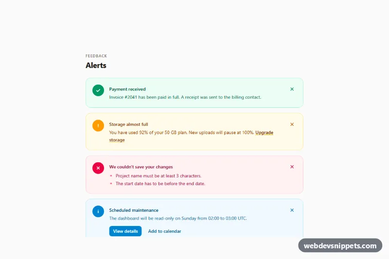
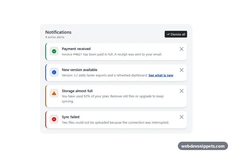
A collection of four Tailwind CSS alerts (success, warning, error and info) with solid round icons, soft tinted backgrounds and dismiss buttons. Drop them into dashboards, settings pages and forms to confirm actions, warn about limits, list validation errors or announce upcoming events.
How it works
The root is the .tac-alerts section. Each message is a .tac-alert flex row with three parts: a colored icon circle, a text column with an h3 title and body, and a close button marked data-tac-dismiss. Every alert uses one Tailwind color family from top to bottom (emerald, amber, rose and sky) for the border, background, icon and text, so recoloring is a single find and replace. The error alert shows a bulleted list of problems, the warning alert includes an inline link and the info alert has two action links.
The script initializes every .tac-alerts on DOMContentLoaded. Clicking a dismiss button adds .tac-leaving, which style.css animates with an opacity and transform transition, then sets the hidden attribute after 200 ms. The data-tac-reset button ("Show all alerts") appears as soon as one alert is dismissed and restores them all. Without JavaScript the alerts stay visible and fully readable; only dismissing is unavailable.
Customization
- Swap the color family in one alert, for example every
emeraldclass toteal, to change its tone without touching the others. rounded-2xlon.tac-alert: userounded-mdfor a sharper look, or addborder-l-4for a classic accent bar.bg-emerald-600(and siblings) on the icon circle: replace withbg-white text-emerald-600 ring-1 ring-emerald-200for an outlined icon.- Delete the
data-tac-dismissbutton from an alert that must stay visible, such as a blocking error. - Remove the
data-tac-resetbutton if you do not need to bring dismissed alerts back. - The 200 ms delay in
script.jsshould match thetransitionduration on.tac-alertinstyle.cssif you slow the exit down.
Accessibility
Each alert has role="group" with aria-labelledby pointing at its title, so screen reader users hear what the block is about. Icons are decorative and hidden with aria-hidden, and the meaning is always spelled out in the title, never by color alone. Every close button has a visually hidden label such as "Dismiss: Storage almost full". After a dismissal focus moves to the next alert's close button, the previous one, or the reset button, so keyboard users never lose their place, and a visually hidden role="status" message confirms the action. Text colors use the 800 and 900 shades on 50 backgrounds for strong contrast, focus outlines are visible on all controls and the exit animation is removed under prefers-reduced-motion.
Usage notes
These alerts are static page content, so they do not use role="alert". When you insert an alert with JavaScript in response to an action (for example a failed save), add role="alert" to the error variant so it is announced immediately.