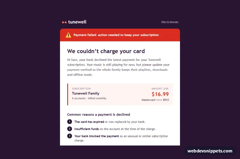
Payment Failed Email
Email-safe card declined template with an alert banner, subscription and amount summary, decline reasons, update payment button and relative retry wording.
Components tagged with "alert".
8 components
Email-safe card declined template with an alert banner, subscription and amount summary, decline reasons, update payment button and relative retry wording.
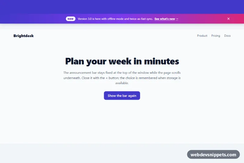
Dismissible gradient announcement bar fixed to the top of the page, with a tag, link, close button, Escape support and remembered dismissal.
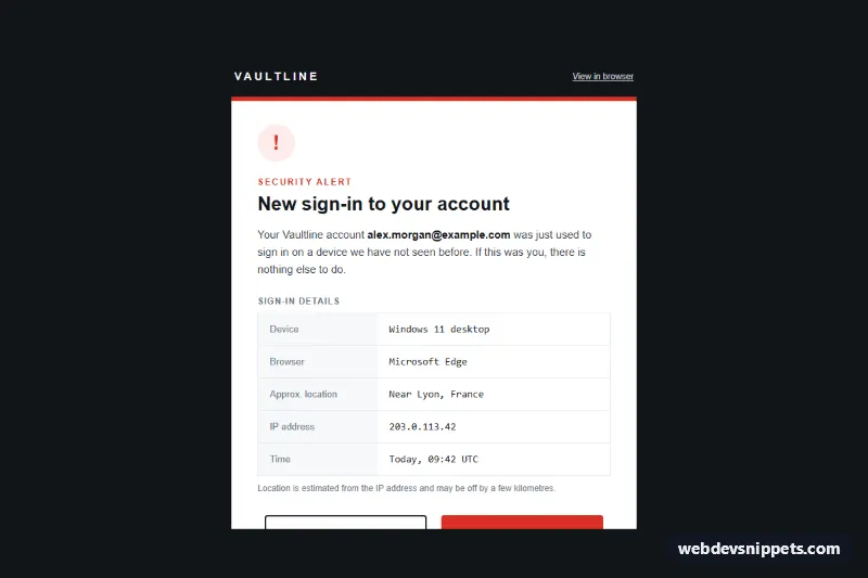
Email-safe security alert template for a new sign-in: device, browser, location, IP and time rows plus "This was me" and "Secure my account" buttons.
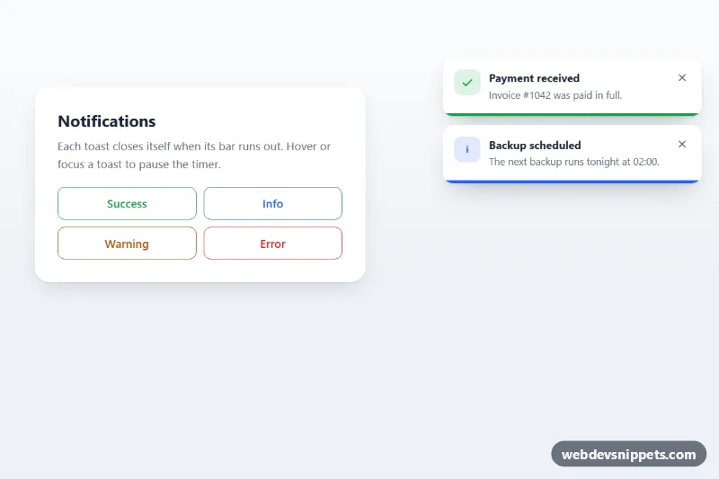
Stacked toast notifications with a CSS countdown progress bar that pauses on hover or focus and closes the toast when it runs out.
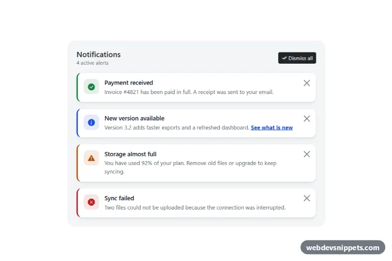
Bootstrap 5 dismissible alerts with icons, headings, per-alert close buttons, dismiss all, restore and screen reader announcements.
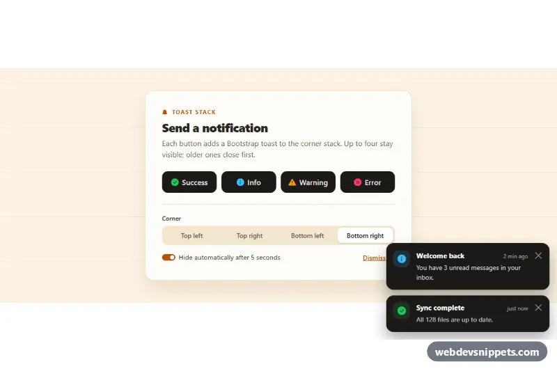
Bootstrap 5 toast notifications in a corner stack: success, info, warning and error buttons, selectable corner, auto-hide with a progress bar and a stack limit.
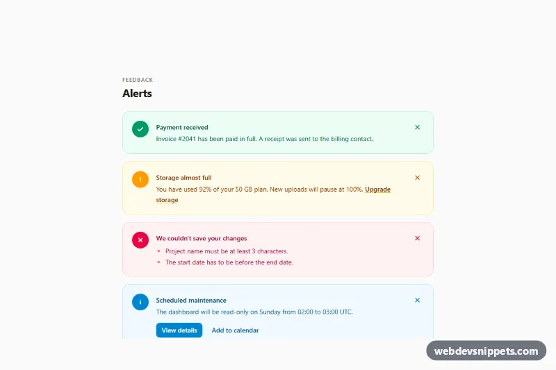
Tailwind CSS alerts collection with success, warning, error and info variants, icons, action links and accessible dismiss buttons.
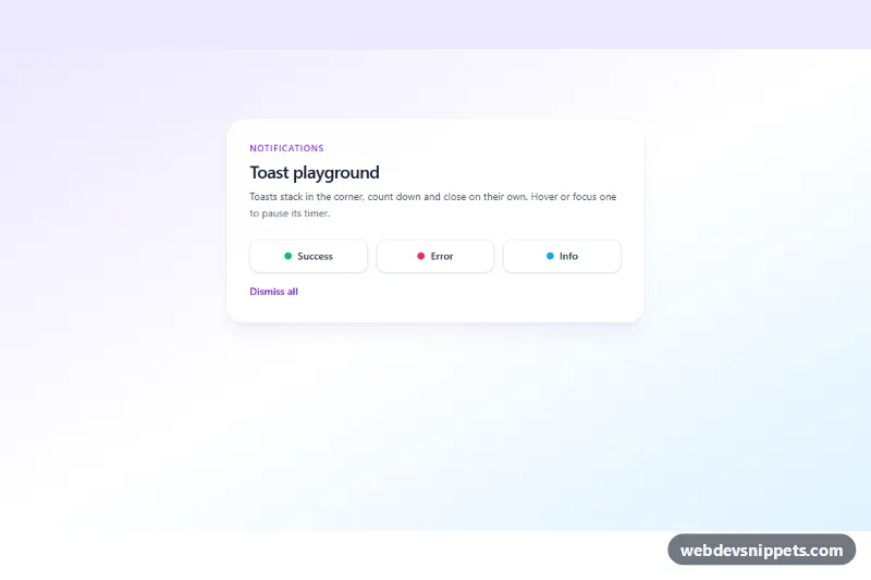
Stacking Tailwind CSS toast notifications for success, error and info with auto-dismiss countdown, pause on hover and accessible live region.