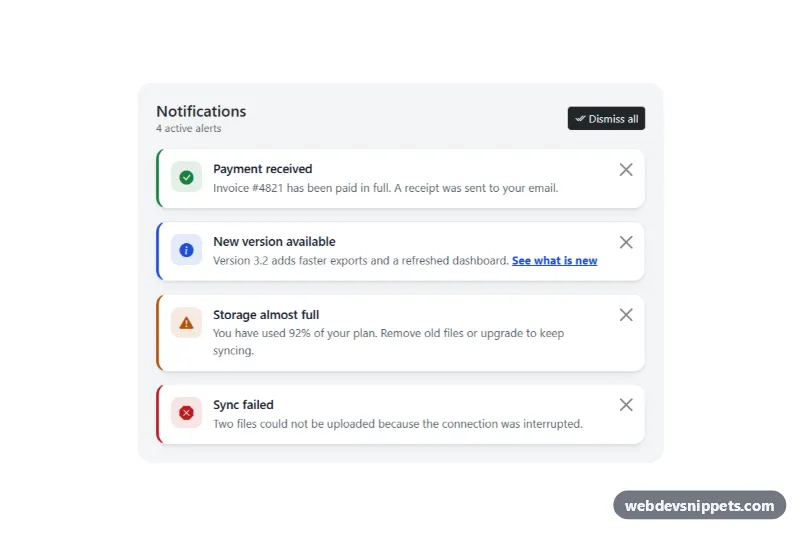
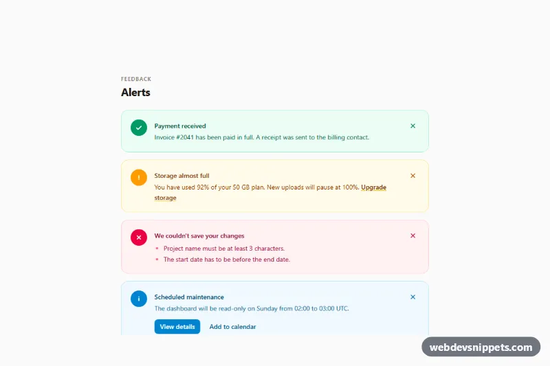
A Bootstrap 5 notification panel with four dismissible alerts (success, info, warning and danger), each with a Bootstrap Icons symbol, a heading and a close button, plus "Dismiss all" and "Restore all" controls. Use it at the top of a dashboard, an account page or an admin area to show status messages users can clear.
How it works
The root .da-panel is a light grey card that holds a header (title, the .da-count text and two buttons) and the .da-list grid. Every alert is a standard .alert.alert-dismissible.fade.show element with the extra class .da-alert and a tone modifier such as .da-alert--warning. Inside it, .da-alert__icon is a rounded tile tinted with color-mix(), .da-alert__body holds the .da-alert__title heading and the message, and a .btn-close with data-bs-dismiss="alert" lets Bootstrap's own Alert plugin fade the alert out and remove it.
The CSS turns the alerts into white cards; each modifier sets --da-tone, which colours the left border, icon and links.
The script runs on DOMContentLoaded for every .da-panel. It stores clones of the original alerts, then listens to Bootstrap's close.bs.alert event on .da-list and to closed.bs.alert on each alert (Bootstrap fires it after removing the element, so it cannot bubble). After a single dismissal it updates the counter, announces "Storage almost full dismissed. 2 remaining." in the .da-live region and moves focus to the next alert's close button. .da-dismiss-all calls bootstrap.Alert.getOrCreateInstance(alert).close() on every alert, .da-restore puts the stored clones back, and .da-empty shows "You are all caught up." when the list is empty. Without this script the close buttons still work.
Customization
--da-success,--da-info,--da-warningand--da-dangeron.da-panelinstyle.css: change the accent colour of each alert type.- Add a new tone: create a class such as
.da-alert--neutral { --da-tone: #475569; }and use it on an alert. --da-radiuson.da-panel: make the alert cards sharper or rounder.border-left: 4px solid var(--da-tone)in.da-alert: widen the stripe or replace it with a full border.- The
bi-*class inside.da-alert__icon: swap the icon for any Bootstrap Icons glyph. - Delete the
.da-restoreand.da-dismiss-allbuttons if you only need per-alert closing; the script checks for both and keeps working without them. max-width: 680pxin.da-panel: let the panel fill a wider column.
Accessibility
Each close button has its own aria-label, such as "Dismiss: Sync failed", so screen reader users know which alert they are closing. Icons are aria-hidden="true" and meaning is carried by the heading text, not colour alone. Changes are announced through the visually hidden role="status" element, and focus never drops to the page body after an alert is removed. The static alerts do not use role="alert" because they are present on page load; add it only to alerts you insert later. Focus rings use :focus-visible, and the fade transition is turned off with prefers-reduced-motion.
Usage notes
Requires Bootstrap 5 (added automatically) and Bootstrap Icons. Several .da-panel blocks can live on one page; each keeps its own counter and restore list.