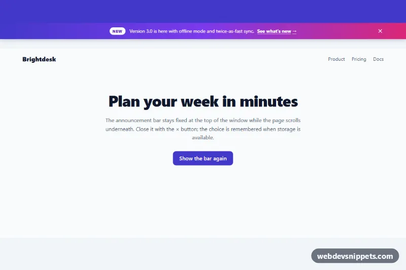
Top Announcement Bar
Dismissible gradient announcement bar fixed to the top of the page, with a tag, link, close button, Escape support and remembered dismissal.
Inline messages for success, warning and error states.
3 component(s)
Dismissible gradient announcement bar fixed to the top of the page, with a tag, link, close button, Escape support and remembered dismissal.
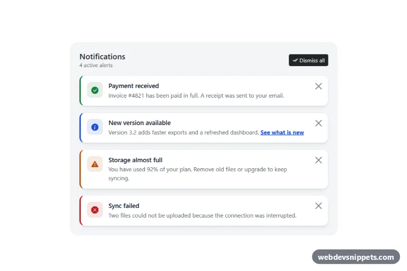
Bootstrap 5 dismissible alerts with icons, headings, per-alert close buttons, dismiss all, restore and screen reader announcements.
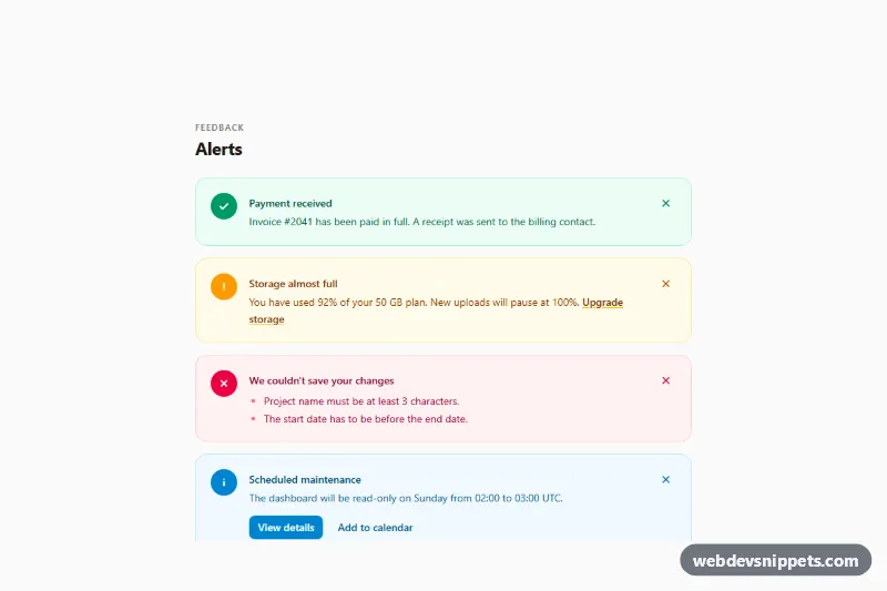
Tailwind CSS alerts collection with success, warning, error and info variants, icons, action links and accessible dismiss buttons.
An alert is an inline message box that communicates the status of an action or the state of the page. Typical variants are success, info, warning and error (danger). Unlike toasts, alerts stay in the layout until the user dismisses them or the condition changes, so they are used for form submission results, account warnings, system notices and important information at the top of a page or section.
Alerts that appear after an action should be announced: use role="alert" for errors and urgent warnings, and role="status" for success or neutral information. Alerts that are present on page load do not need a live role. Check the text contrast inside each coloured variant; pale yellow warning boxes often need darker text. The dismiss button needs an aria-label such as "Close alert". For form errors, also link each field message with aria-describedby so the problem is announced on the field itself.
These bootstrap alert examples and alert box HTML CSS snippets are available in Bootstrap 6, Bootstrap 5, Tailwind CSS and pure CSS. Bootstrap 5 versions use alert alert-success and friends; Bootstrap 6 versions use the theme-* colour roles so every variant follows your theme. Tailwind and pure CSS versions use utility classes or custom properties for the colour sets. Compare them in the live preview, then copy the code from the code tabs or download it.