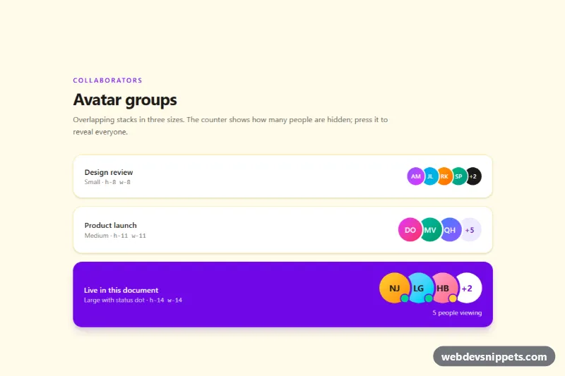
An overlapping avatar group built with Tailwind CSS, shown in three sizes with a "+N" counter that reveals the hidden people. Use it for collaborators on a project card, attendees of a meeting, reviewers of a pull request or "who is viewing this document" indicators.
How it works
The root is .tav-root. Each stack is a container marked data-tav-group that holds a ul with data-tav-list. Avatars are initials on gradient circles (.tav-avatar), so no images are required. The overlap comes from negative spacing utilities on the list (-space-x-1.5, -space-x-2, -space-x-3), and a ring in the background color of the card draws the white or violet cut-out between neighbours. The counter button data-tav-more sits in the last list item so the spacing stays consistent whether the stack is collapsed or expanded.
People beyond the visible limit are list items with data-tav-extra and the hidden attribute. On DOMContentLoaded the script finds every data-tav-group inside each .tav-root, counts its data-tav-extra items and writes the counter text itself, so the "+5" always matches the markup. Clicking the counter toggles hidden on the extras, adds the tav-in class to play the tav-pop animation, and switches the label to a minus sign. If a group has no extras, the counter is hidden. The large variant also fills data-tav-summary with the total number of people.
style.css gives earlier list items a higher z-index (:nth-child(1) to :nth-child(9)), so each circle covers the edge of the next one instead of hiding its initials. It also adds the name tooltip (.tav-tip) that appears on hover and lifts the hovered avatar above its neighbours.
Customization
- Move
data-tav-extra hiddento more or fewer list items: the counter updates automatically, e.g. "+3" instead of "+5". - Change
h-11 w-11on.tav-avatarand the matching-space-x-2ondata-tav-listto create another size; larger avatars need a larger negative space. - Swap
from-violet-500 to-fuchsia-500on an avatar for any gradient, or replace the initials with animg(https://placehold.co/88x88) withrounded-full object-cover. ring-white/ring-violet-700on avatars: match the ring color to the surface the group sits on.- The status dots (
bg-emerald-400online,bg-amber-300away) in the large group can be removed or recolored; update the matchingsr-onlytext. bottom: calc(100% + 0.5rem)in.tav-tip: change totopto place the tooltip below the avatars.- Delete
@keyframes tav-popand the.tav-inrules to reveal avatars without animation.
Accessibility
Each group is a real list with a descriptive aria-label. Initials are aria-hidden; every person has a visually hidden full name (including online or away status), so screen readers never read "AM, JL". The counter is a native button with aria-expanded, aria-controls pointing at its list and an aria-label such as "Show 5 more product launch members". It has a visible focus-visible outline, and all motion is disabled under prefers-reduced-motion: reduce.
Usage notes
Several groups and several .tav-root sections can live on one page; list ids are generated when missing.