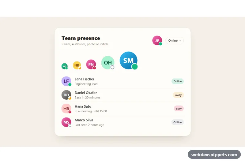
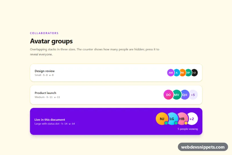
A Bootstrap 5 avatar set with presence indicators: five sizes, four statuses (online, away, busy, offline), automatic initials when a photo is missing, and a dropdown that lets the current user change their own status. Use it in chat apps, team directories, admin dashboards and comment threads.
How it works
Everything lives inside section.avs-root. Each avatar is a .avs-avatar circle with a data-name, an optional img.avs-img, a .avs-initials span underneath it and a .avs-dot whose data-status picks the indicator. Size modifiers (.avs-avatar--xs to .avs-avatar--xl) only change the --avs-size custom property; the initials, the dot and its ring all scale from it with calc(). The statuses differ in shape as well as color: online is a solid dot with a soft pulse, away has a cut-out, busy has a white bar and offline is a hollow ring. The team list uses a flush Bootstrap list-group with .avs-label pills that tint themselves from the same status color.
On DOMContentLoaded the script processes every .avs-root. toneFor() hashes each data-name into one of six data-tone gradients, so a person always gets the same color. If .avs-initials is missing or empty, initialsFor() builds it from the first and last name. If a photo fails to load, its error listener removes the image and the initials show through. The data-set-status buttons in the Bootstrap dropdown update the current user's dot, the button label, aria-current on the chosen option and the avatar's aria-label.
Customization
--avs-online,--avs-away,--avs-busyand--avs-offlinein.avs-root: recolor the dots, the menu swatches and the list pills at once.--avs-ringin.avs-root: set it to your page background so the cut-out ring around each dot matches.--avs-sizein.avs-avatar--xl(or a new modifier): create another avatar size; everything inside scales with it.data-statuson any.avs-dot: switch a person betweenonline,away,busyandoffline, and update the avatar'saria-labelto match..avs-avatar[data-tone="0"]to[data-tone="5"]instyle.css: change the initials gradients; raiseTONESinscript.jsif you add more.- Remove the
img.avs-imgfrom an avatar to show initials only, or add one (https://placehold.co/160x160) to show a photo. - The
setStatus()function inscript.js: add afetch()call there to save the chosen status on your server.
Accessibility
Standalone avatars use role="img" with an aria-label such as "Priya Nair, busy", while the initials and dots are aria-hidden. In the list the avatars are hidden from assistive technology because the name and the text pill already say the same thing. Status is never conveyed by color alone thanks to the different dot shapes. The picker is a native Bootstrap dropdown with keyboard support, its options mark the active choice with aria-current, and the .avs-status live region announces changes. The pulse animation is removed under prefers-reduced-motion: reduce.
Usage notes
Requires Bootstrap 5 including its JavaScript bundle for the dropdown (both added automatically). Copy any single .avs-avatar into your own layout; it works anywhere inside an .avs-root.