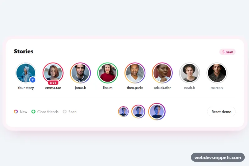
Story Ring Avatars with Gradient Border
Pure CSS story avatars with Instagram-style gradient rings, close friends and live variants, and a seen state that turns the ring grey on click.
Components tagged with "avatar".
10 components
Pure CSS story avatars with Instagram-style gradient rings, close friends and live variants, and a seen state that turns the ring grey on click.
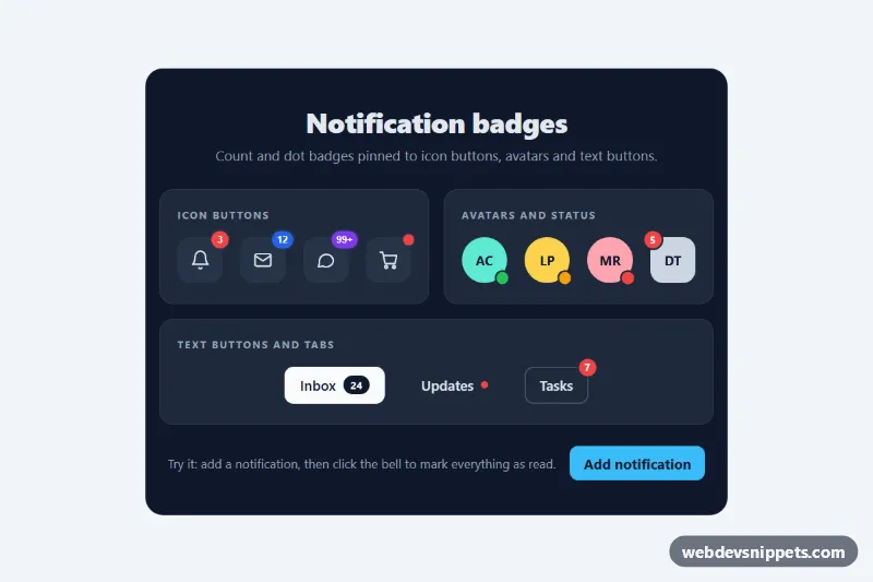
Pure CSS notification badges: count bubbles, 99+ pills, pulsing dots and status dots positioned on icon buttons, avatars and text buttons.

Tailwind CSS edit profile form with drag-and-drop photo upload and live preview, bio character counter, social link fields and simulated save.
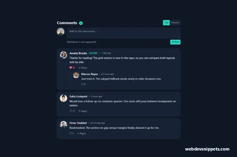
Dark Bootstrap 5 comment section with user photos, timestamps, like buttons, inline reply forms, nested replies and Top/Newest sorting.

Bootstrap 5 popover hover card showing a user photo, cover band, bio, follower stats and a working follow button.
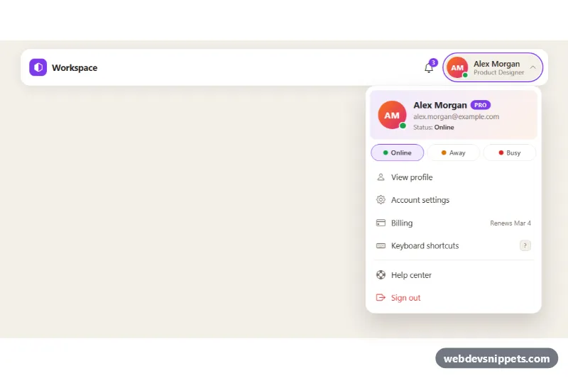
Bootstrap 5 avatar dropdown with profile header, plan badge, online/away/busy status picker and account menu links for app headers.
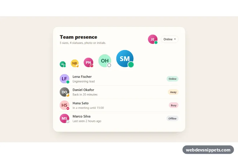
Bootstrap 5 avatars in five sizes with online, away, busy and offline status dots, initials fallback for missing photos and a status picker.
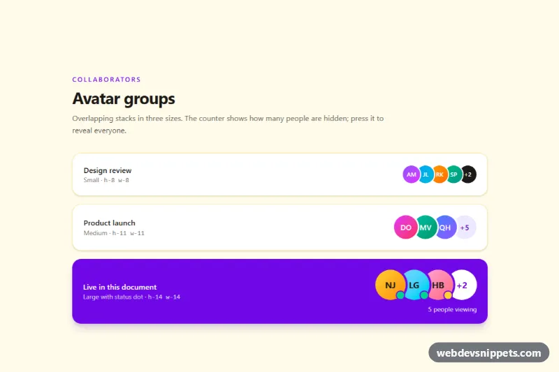
Overlapping Tailwind CSS avatar stack in three sizes with initials, status dots, name tooltips and a +N counter that reveals hidden people.

Tailwind CSS profile card with a gradient cover, overlapping avatar, verified badge, bio, skill chips, stats and an accessible follow toggle.

Dark Tailwind CSS user list with initials avatars, online status, meta details and accessible Follow toggle buttons with a live counter.