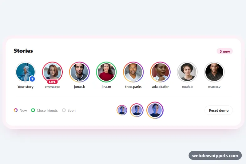
Story Ring Avatars with Gradient Border
Pure CSS story avatars with Instagram-style gradient rings, close friends and live variants, and a seen state that turns the ring grey on click.
User images, initials and avatar groups.
3 component(s)
Pure CSS story avatars with Instagram-style gradient rings, close friends and live variants, and a seen state that turns the ring grey on click.
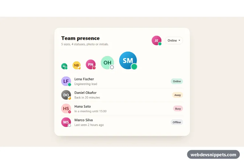
Bootstrap 5 avatars in five sizes with online, away, busy and offline status dots, initials fallback for missing photos and a status picker.
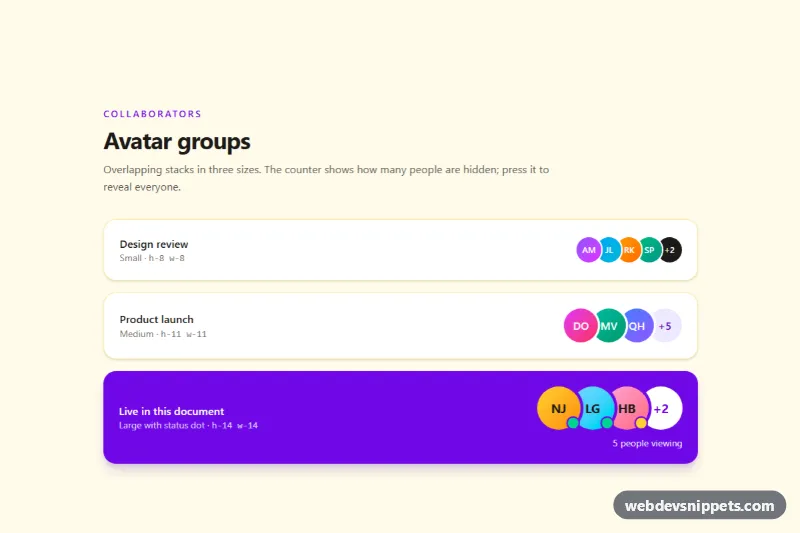
Overlapping Tailwind CSS avatar stack in three sizes with initials, status dots, name tooltips and a +N counter that reveals hidden people.
An avatar is a small visual that represents a user or entity: a profile photo, initials on a coloured background, or an icon placeholder. Avatars appear in navbars, comment threads, chat lists, assignee fields, team pages and anywhere a person needs to be identified at a glance. Avatar groups stack several avatars with an overlap to show participants, collaborators or followers in little space.
object-fit: cover on images so faces are never stretched, and set width and height to avoid layout shift.alt=""; otherwise use the person's name as the alt text.title.The examples on this page cover photo avatars, initials, status indicators and stacked groups, each with a live preview and code tabs. Bootstrap 6 snippets use theme-* colour roles for initials backgrounds and status rings, Bootstrap 5 snippets combine utilities like rounded-circle with a few lines of custom CSS, Tailwind CSS snippets rely on rounded-full, ring and negative spacing for groups, and pure CSS versions use a handful of classes. Filter by framework, copy the HTML and CSS, and replace the image URLs with your own.