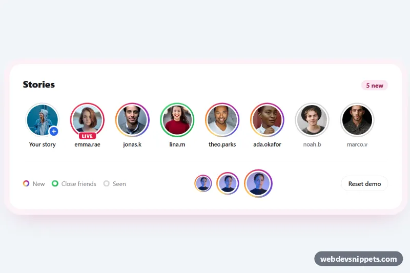
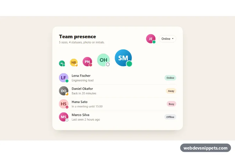
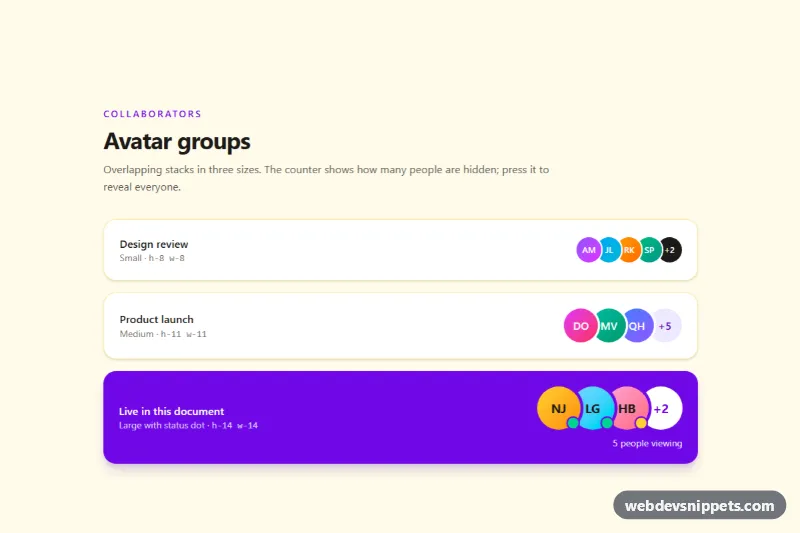
A row of story avatars in the style of social apps, built with pure CSS and a little vanilla JavaScript. Each round photo sits inside a gradient ring that signals a new story, a green ring for close friends, a red ring with a Live badge, and a thin grey ring once the story has been seen. Use it above a feed or in a messaging sidebar.
How it works
The root section.sra-stories holds a header with a .sra-count badge, the scrollable ul.sra-list and a .sra-footer with a legend, size samples and a reset button. Every story is a button.sra-story that contains a .sra-ring, an img.sra-avatar and a .sra-name. The ring is not a border: .sra-ring has padding equal to --sra-ring-width, and its ::before pseudo element fills the circle behind the photo with var(--sra-ring-bg, var(--sra-gradient)). A solid photo border (--sra-gap) creates the white gap between ring and face. On hover or keyboard focus the pseudo element rotates, so the conic gradient appears to spin around the avatar.
Modifiers only change --sra-ring-bg: .sra-story--close uses --sra-close, .sra-story--live uses --sra-live, and .is-seen switches to --sra-seen and a 2px ring. .sra-story--own shows a thin grey ring with a blue .sra-add plus badge.
The script remembers each story's initial state, adds .is-seen when a story is clicked, updates the hidden .sra-state text and recounts unseen stories into .sra-count-num. The .sra-reset button restores the starting state. Without JavaScript the rings and states still render from the markup.
Customization
--sra-gradienton.sra-stories: the ring for new stories; swap the conic gradient for your brand colors.--sra-close,--sra-liveand--sra-seen: ring colors for close friends, live and seen stories.--sra-size: the avatar diameter (68px on phones, 72px from 640px); the classes.sra-size-sm,.sra-size-mdand.sra-size-lgshow how to override it per avatar.--sra-ring-widthand--sra-gap: thickness of the ring and of the white gap around the photo.--sra-spin: duration of one rotation of the hover animation, e.g.1.2sfor a faster spin.- Add
is-seento any.sra-storyin the markup to start it as viewed, and set its.sra-statetext to ", seen". - Replace the comment in the click handler of
script.jswith code that opens your own story viewer.
Accessibility
Every story is a native button, so it is reachable with Tab and activated with Enter or Space. The visible username is part of the button label, and a visually hidden .sra-sr span adds the state ("new story", "close friends", "live now" or "seen"), so color is never the only cue. Photos use an empty alt because the name already labels the button. The unseen counter sits in an aria-live="polite" region. Focus shows a violet outline (--sra-focus), and with prefers-reduced-motion: reduce the spinning ring and press effect are disabled.
Usage notes
The portraits come from Unsplash; replace them with your users' own profile images. The script scopes everything to each .sra-stories root, so several rows can share a page.