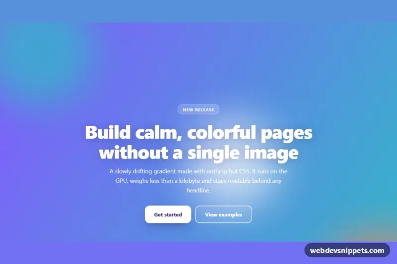
An animated gradient background in pure CSS: a hero section whose coral, pink, violet and teal gradient drifts slowly, with blurred color blobs and a fine grain texture on top. Use it for landing page heroes, sign-up screens, launch announcements or any section that needs color without images.
How it works
The root section.agb-hero paints a five-stop linear-gradient built from --agb-color-1 to --agb-color-4 (the first color repeats at the end so the loop has no hard edge). The gradient is four times larger than the section (background-size: 400% 400%), and the agb-shift keyframes move its background-position back and forth with animation-direction: alternate. Only the visible window of the gradient changes, so the colors appear to flow.
Behind the content, .agb-blobs holds three .agb-blob circles. The wrapper applies filter: blur(60px), each blob uses mix-blend-mode: soft-light, and the agb-float keyframes translate and scale them. Negative animation-delay values put the blobs out of phase from the first frame. .agb-grain overlays an inline SVG feTurbulence noise at low opacity, which hides gradient banding on large screens. The section uses isolation: isolate, so the negative z-index layers stay inside it.
The content block .agb-content holds an eyebrow pill, the heading, a lead paragraph and two buttons (.agb-btn--solid and .agb-btn--ghost), which stack on phones and sit side by side from 560px. No JavaScript is needed.
Customization
--agb-color-1to--agb-color-4on.agb-hero: replace the palette; the blobs reuse colors 1 and 4, so they follow automatically.--agb-speed: the duration of one gradient sweep (default18s); lower values make the motion livelier.--agb-blob-speed: how fast the blurred blobs drift (default24s).--agb-angle: the direction of the gradient, e.g.45degfor a diagonal from bottom left.--agb-min-height: the minimum height of the section (default100vh, a full-screen hero); use36remfor a shorter banner.- Change
opacityon.agb-grainto0to remove the noise, or raise it for a more textured, print-like look. - Delete the
.agb-blobselement if you only want the flowing gradient.
Accessibility
The section is labelled by its heading through aria-labelledby="agb-title". The blob and grain layers are decorative and marked aria-hidden="true". Headline text carries a soft text-shadow so the white type stays readable over the lighter coral and teal stops; check contrast again if you swap in pale colors. Both buttons show a white :focus-visible outline with an offset. With prefers-reduced-motion: reduce the gradient and blob animations stop and the gradient stays still, and the hover lift on the buttons is disabled.
Usage notes
Animating background-position is cheap for one hero, but avoid running many large animated gradients on the same page. Several .agb-hero sections can coexist; give each its own colors by overriding the custom properties on a modifier class.