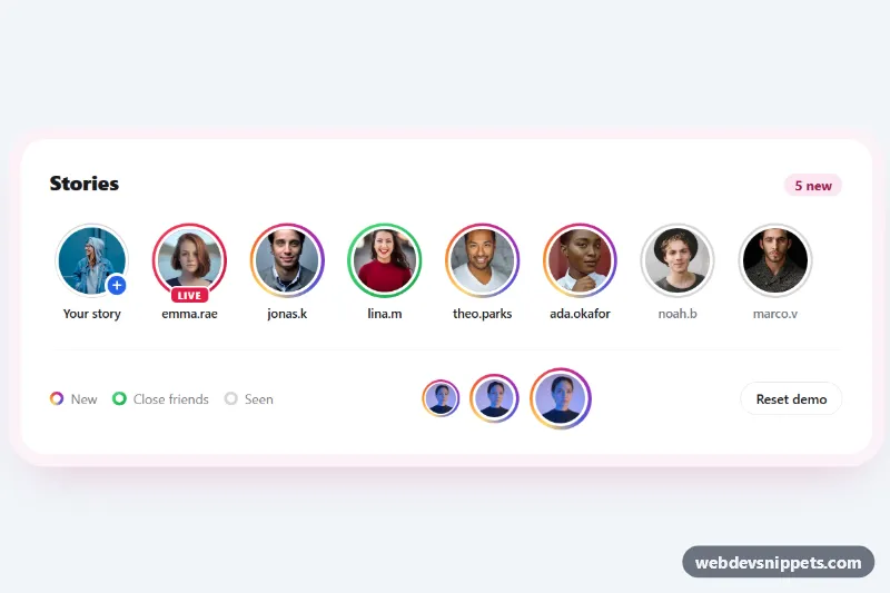
Story Ring Avatars with Gradient Border
Pure CSS story avatars with Instagram-style gradient rings, close friends and live variants, and a seen state that turns the ring grey on click.
Components tagged with "gradient".
11 components
Pure CSS story avatars with Instagram-style gradient rings, close friends and live variants, and a seen state that turns the ring grey on click.

Pure CSS animated background with blurred, morphing color blobs drifting behind a hero headline, with a pause button and reduced-motion support.
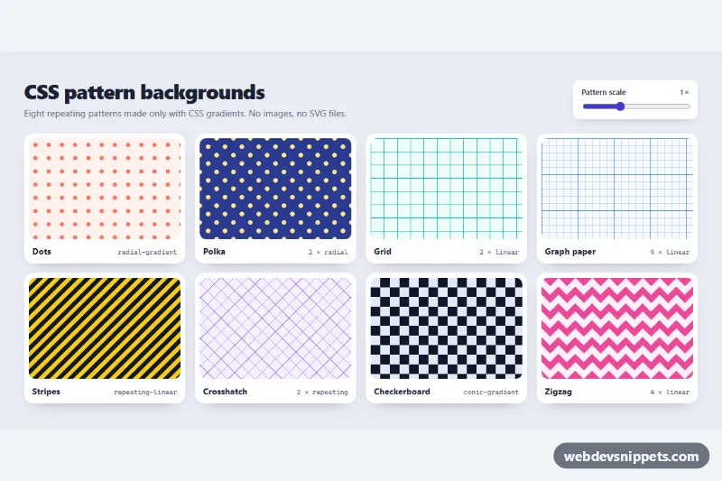
Eight pure CSS gradient background patterns (dots, polka, grid, graph paper, stripes, crosshatch, checkerboard, zigzag) with a live scale slider.
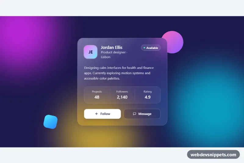
Frosted glass profile card in Tailwind CSS with backdrop blur, a light reflection and a follow button over colorful animated gradient blobs.

Pure CSS hero section with a slowly shifting multi-color gradient, drifting blurred blobs and a grain overlay, customizable through CSS variables.
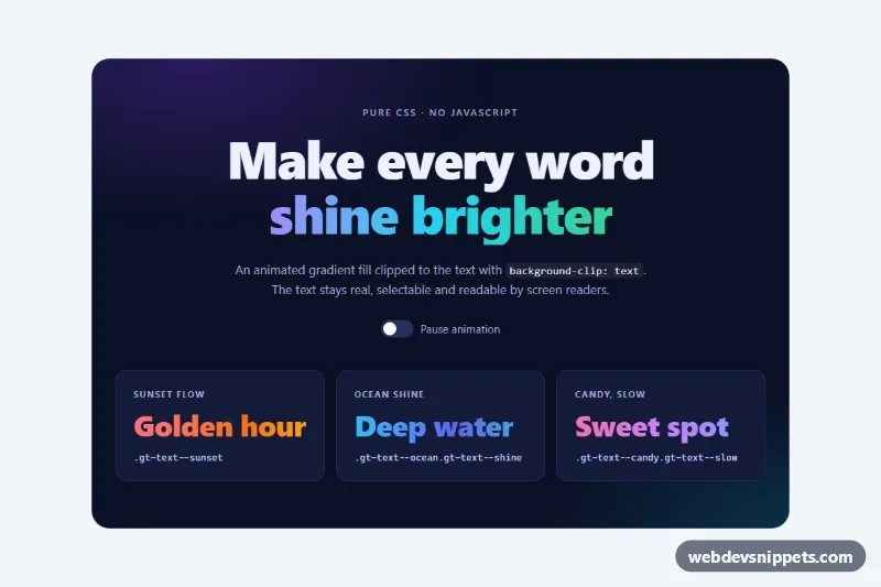
Pure CSS animated gradient text for headings using background-clip, with four palettes, a shine sweep variant, a CSS-only pause switch and a fallback color.
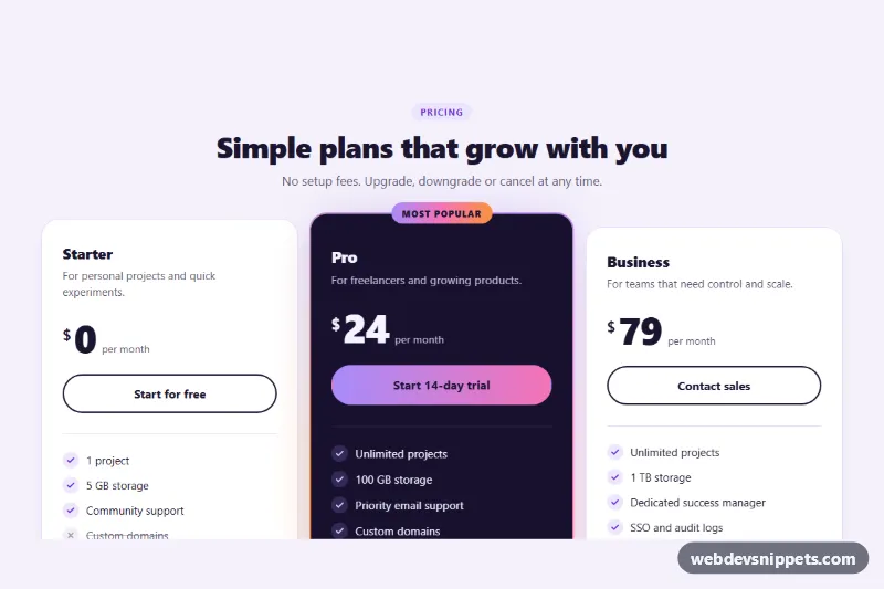
Three pure CSS pricing cards with hover lift and a featured plan that has a spinning conic-gradient border, glow and Most popular badge.
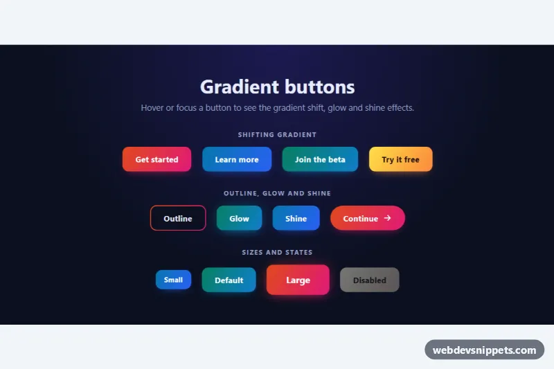
Pure CSS gradient buttons with shifting colors on hover, a gradient outline, glow and shine effects, sizes and a disabled state.
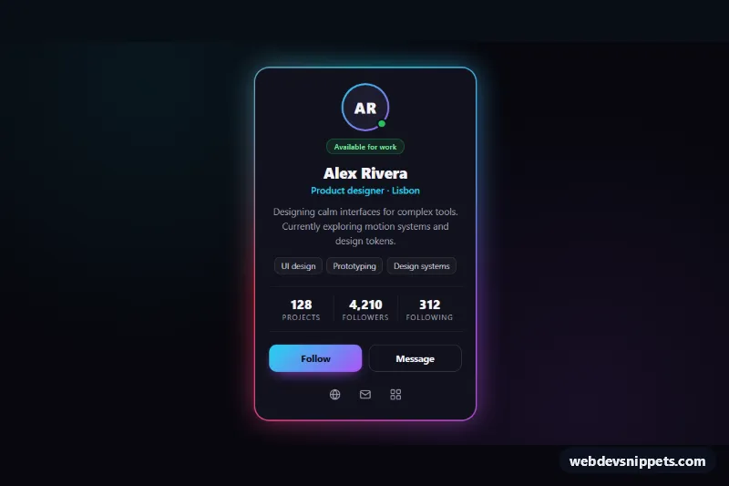
Dark profile card with an animated neon conic-gradient border, soft glow, stats, skill tags and a Follow toggle, built with pure CSS and vanilla JS.
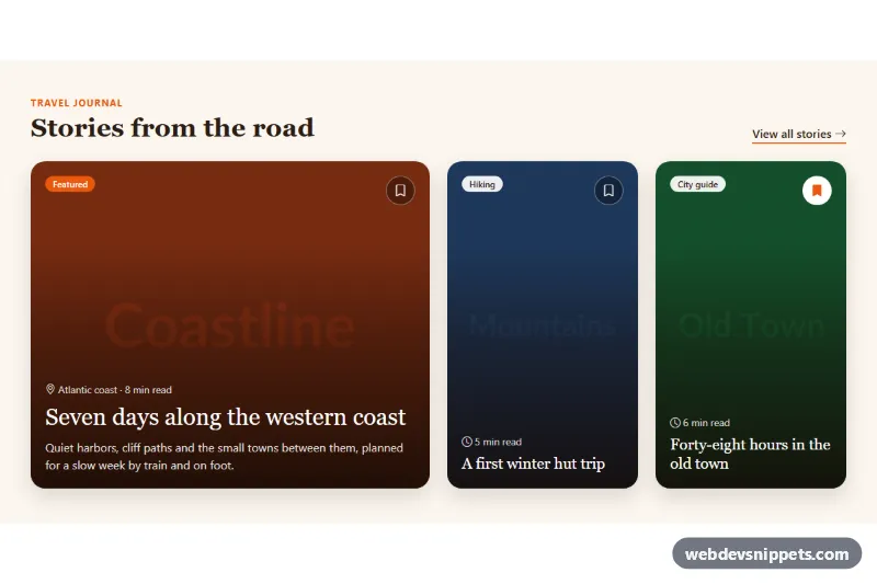
Bootstrap 5 image cards with text overlaid on photos, a readability gradient, category badges, save buttons and a featured layout.

Bold full-width Tailwind CSS call-to-action band with a gradient background, two buttons and reassurance points.