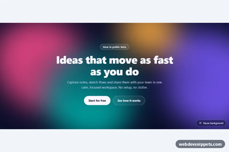
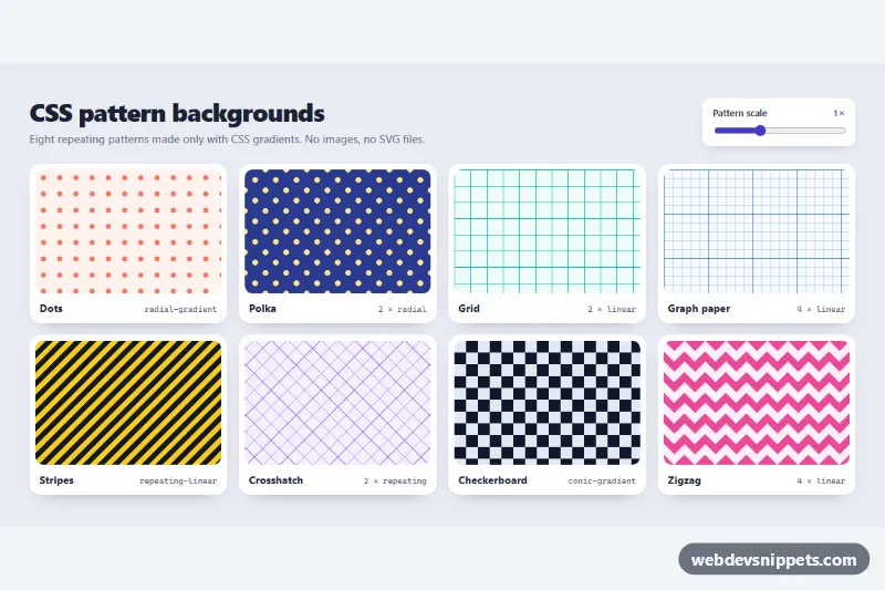
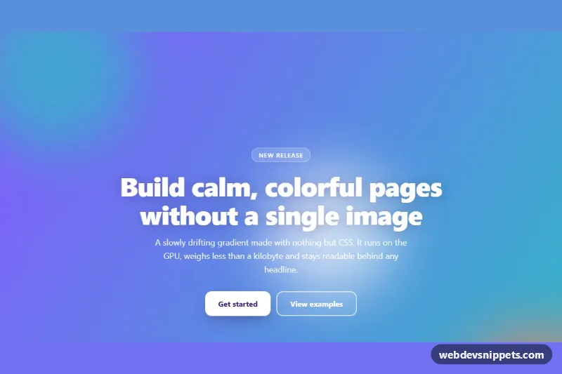
An animated gradient background made of soft, morphing color blobs that drift slowly behind your content. It is built with pure CSS plus a tiny script for a pause button, and works well behind landing page heroes, sign-up sections, product launches and "coming soon" pages.
How it works
The root section.abg is a dark, centered grid with isolation: isolate, so its layers stack only inside the section. The first layer, .abg-blobs, holds four span.abg-blob elements. A single filter: blur() on the wrapper (not on each blob) merges the shapes into smooth color clouds and keeps rendering cheap.
Each blob runs two animations at once. abg-morph changes the eight-value border-radius, which makes the outline wobble and reshape, and rotates the blob. abg-drift moves and scales it with the individual translate and scale properties, so the two animations never overwrite each other's transform. Negative animation-delay values on .abg-blob--1 to .abg-blob--4 start every blob at a different point, so the picture already looks lively on the first frame.
Above the blobs, .abg-veil adds a dark radial gradient behind the text for contrast. .abg-content holds the eyebrow badge, heading, text and two buttons. The script listens for click on .abg-toggle in each .abg root and toggles the is-paused class, which sets animation-play-state: paused on the blobs. Without JavaScript the background simply keeps moving.
Customization
--abg-c1to--abg-c4on.abg: the four blob colors. Use two shades of your brand color for a calmer look.--abg-bg: the base background color that shows between the blobs.--abg-blur: blur radius of the blob layer;40pxgives more defined shapes,120pxa hazy glow.--abg-speed: duration of one morph cycle (the drift takes 1.5 times longer); raise it to30sfor a very slow, ambient motion.--abg-size: blob size, set withclamp()so the blobs scale with the viewport.min-heighton.abg: the section height; set it to100vhfor a full-screen hero.- Remove
.abg-veilif your content sits in its own card and no extra darkening is needed.
Accessibility
The blob layer and the veil are aria-hidden="true", so screen readers only meet the heading, text and links. The section is labelled by its heading through aria-labelledby. Long-running motion can be stopped with the .abg-toggle button, which reports its state with aria-pressed. With prefers-reduced-motion: reduce all blob animations are removed, the background becomes a still gradient and the pause button is hidden. Buttons and links have a visible amber focus outline, and the white text sits on a darkened area for good contrast.
Usage notes
Several sections can share a page; the script handles each .abg separately. Large blur filters cost GPU time, so avoid stacking many animated sections on one screen.