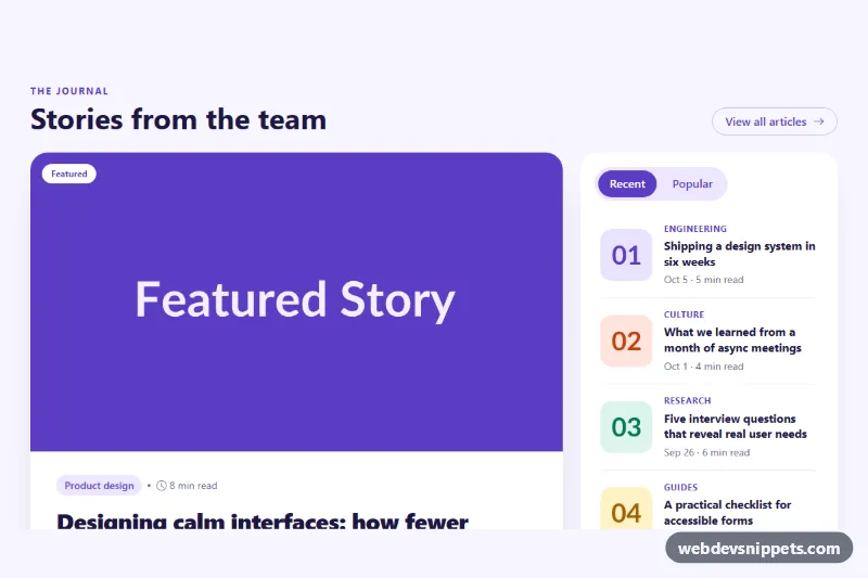
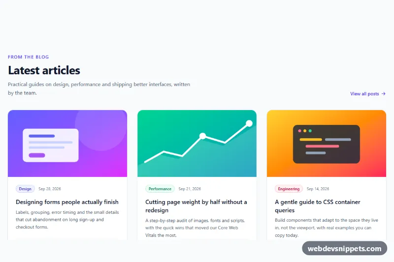
A Bootstrap 5 blog section that pairs one large featured article with a sidebar of recent and popular posts in switchable tabs. Use it at the top of a blog index, on a magazine-style homepage or as a "latest from the journal" block on a marketing site.
How it works
The root is section.bfp-blog, which holds the color tokens and a soft lavender background. A header row shows the section title and a pill-shaped "View all articles" link. Below it, a Bootstrap row splits the content into a col-lg-8 featured column and a col-lg-4 sidebar; on smaller screens the sidebar drops under the featured story.
The featured story is an article.bfp-featured card. .bfp-featured__media holds a 16:9 image and the floating .bfp-badge; the image zooms slightly on hover. .bfp-featured__body is a flex column with the category pill, read time, title, excerpt and an author row with a gradient .bfp-avatar. The title link uses Bootstrap's stretched-link, so the whole card is clickable, while .bfp-category is lifted above it with z-index and stays separately clickable.
The sidebar aside.bfp-side uses Bootstrap's own tab plugin: two nav-link buttons with data-bs-toggle="tab" switch between #bfp-recent and #bfp-popular. No custom JavaScript is needed. Each .bfp-item has a stretched-link title. Recent posts show a square .bfp-thumb; the popular list is an ordered .bfp-list--ranked list where a CSS counter draws outlined numbers 01 to 04 in place of thumbnails.
Customization
--bfp-accentand--bfp-accent-softin.bfp-blog: change the color of the category pills, active tab, ranking numbers and hover titles.--bfp-bgand--bfp-surfacein.bfp-blog: set the section background and the card background.--bfp-radiusin.bfp-blog: make the featured card and the sidebar sharper or rounder.--bfp-thumbin.bfp-blog: resize the sidebar thumbnails and the width of the ranking numbers.aspect-ratio: 16 / 9in.bfp-featured__media img: switch to4 / 3for a taller featured image.col-lg-8andcol-lg-4: change tocol-lg-7andcol-lg-5for a wider sidebar.- Remove the
.bfp-tabslist and the#bfp-popularpane to keep a single list of recent posts.
Accessibility
The section is labelled by its heading, and the sidebar is an aside with aria-label="More posts". The tabs use role="tablist", role="tab", aria-controls and aria-selected, and Bootstrap manages arrow-key navigation between them. Tab panels are focusable with tabindex="0". Sidebar thumbnails are decorative and have empty alt text, avatar initials are aria-hidden, and dates use time elements with machine-readable datetime values. Links, tabs and panels get a strong :focus-visible outline, and the image zoom and hover transitions are disabled under prefers-reduced-motion.
Usage notes
Requires Bootstrap 5 with its JavaScript bundle (both added automatically) and Bootstrap Icons. When using several instances on one page, give each tab and pane a unique id.