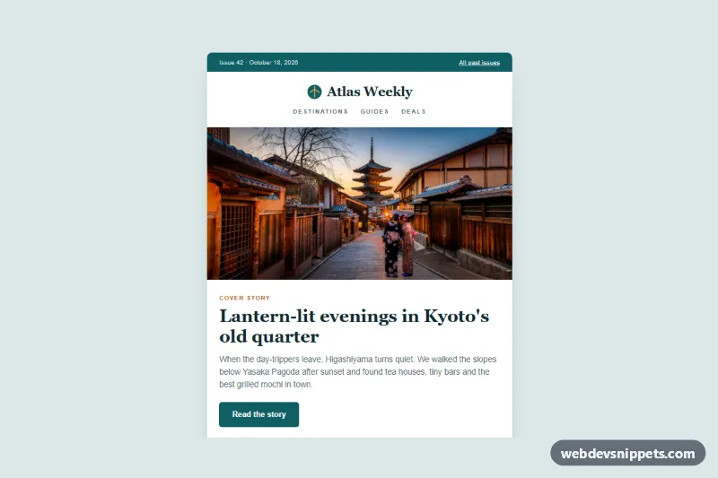
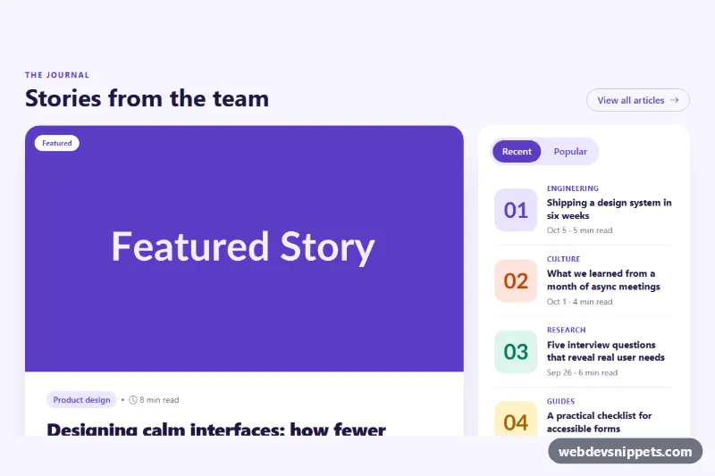
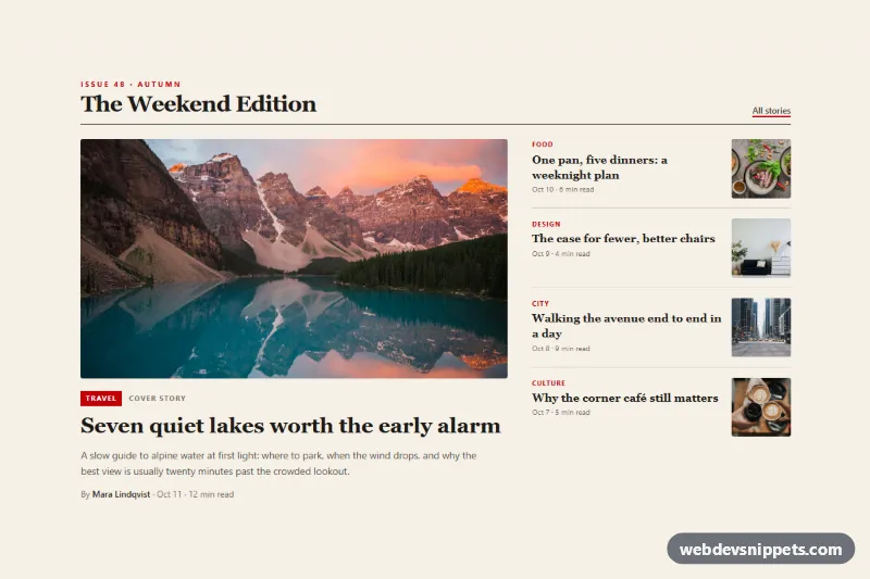
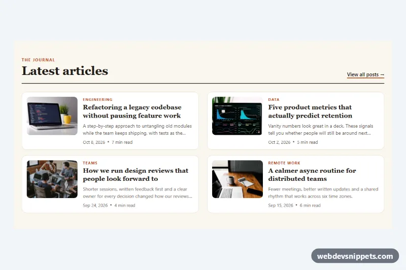
A travel magazine article digest in plain HTML and CSS with a full-width cover photo, a lead story, a two-column grid of photo articles, a side-by-side feature and a dark footer. Use it as a weekly roundup on a blog or magazine site or as the landing page of an issue archive.
How it works
The root .nl-digest paints the outer background and holds all colors as custom properties. Inside it, the full-width table.nl-outer centers table.nl-container, a 600px wide paper card. The layout tables carry role="presentation", so screen readers ignore the table semantics and read the articles in order.
From top to bottom the card shows the .nl-topbar with the issue number, the current date and an "All past issues" link, the .nl-header with an inline SVG logo and .nl-nav links, and the .nl-hero photo cropped to 2:1 with aspect-ratio and object-fit: cover. The .nl-intro block follows with a kicker, the serif .nl-title, a paragraph and the .nl-button call to action. After the .nl-section-title, table.nl-cols places two .nl-col cells side by side, each with an .nl-card-img, an .nl-tag, a title, text and an .nl-link. table.nl-feature pairs a square photo with text on a warm tint, the .nl-tip box highlights a short tip, and the dark .nl-footer holds social icons, the publisher address and links to notification settings and contact.
A small script fills every .nl-date element with today's date and sets its datetime attribute, so the sample issue never shows an outdated date. Without JavaScript the text "This week" stays in place.
On screens narrower than 620px a media query switches the .nl-col, .nl-feature-media and .nl-feature-body cells to display: block, so the articles stack into one column and the feature photo turns into a wide banner.
Customization
--nl-accentand--nl-accent-darkon.nl-digest: the top bar, button, logo circle and link color.--nl-highlight: the orange used in the logo, the tip border and the focus outline.--nl-bg,--nl-paperand--nl-tint: the page background, the card and the feature box background.--nl-serifand--nl-sans: the heading and body font stacks.--nl-width: the maximum width of.nl-container; also update thewidth="600"attribute on the table.aspect-ratio: 2 / 1in.nl-hero-img: use16 / 9or3 / 1for a taller or slimmer cover photo.- Duplicate a
trwithtd.nl-cols-wrapto add another row of two articles.
Use cases
- Travel blogs: a weekly roundup shows a cover photo, a lead story and photo articles
- Magazine sites: a feature block and two-column article grid present each issue
- Issue archives: a landing page for one issue with an All past issues link
- Content roundups: articles stack into one column on phones for easy reading
Accessibility
The digest has one h1 followed by h2 and h3 headings, and every photo has descriptive alt text plus width and height attributes. The issue date uses a time element. Social links have aria-labels and their SVG icons are aria-hidden. Links show a visible :focus-visible outline, and the muted text colors keep readable contrast on white.
Usage notes
The photos come from Unsplash; replace them with your own images. Point the href="#" links to your articles, archive and contact page. This is a web component; a real newsletter needs table-based HTML with inline styles.