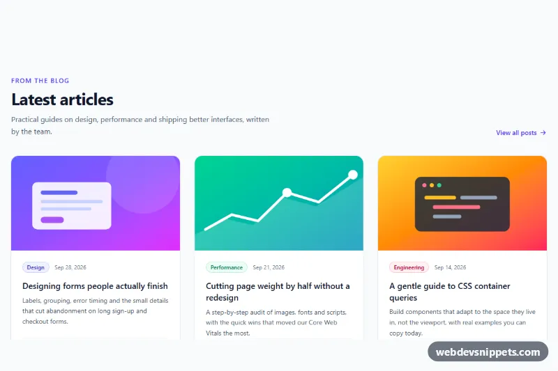
A responsive blog post grid built entirely with Tailwind CSS utility classes. Three article cards show an illustrated cover, a colored category badge, the publish date, a clamped excerpt, the author and the reading time, which makes the section a good fit for a blog index, a "latest articles" band on a landing page or the related posts area under an article.
How it works
The root is section.tbg-blog. A header row holds the eyebrow text, the #tbg-title heading, a short intro and a "View all posts" link; on phones they stack, from sm up the link moves to the right. The posts live in the ul.tbg-grid list, which is one column on phones, two columns from sm and three columns from lg.
Each article.tbg-card is a flex column with h-full, so cards in the same row are always equally tall and the author row is pushed to the bottom with mt-auto. The .tbg-cover area keeps a fixed aspect-[16/9] ratio and combines a Tailwind gradient with a small inline SVG illustration, so no image files are needed. The whole card is clickable through the "stretched link" pattern: the a.tbg-link inside the heading gets an absolutely positioned after: pseudo-element that covers the card, while the markup still contains only one link per post.
Hovering lifts the card with hover:-translate-y-1 and a softer indigo shadow, and the title turns indigo through the group-hover: variant. No JavaScript and no custom CSS are required.
Customization
lg:grid-cols-3on.tbg-grid: change tolg:grid-cols-4for a denser archive, or remove it to keep two columns on desktop..tbg-cover: replace the gradientdivand inline SVG with animgofobject-cover h-full w-full(for example ahttps://placehold.co/640x360placeholder) when you have real cover images..tbg-categorybadges: swapbg-indigo-50 text-indigo-700for another color pair to match each category in your CMS.line-clamp-3on the excerpt: useline-clamp-2for shorter cards or remove it to show the full text.aspect-[16/9]on.tbg-cover: useaspect-squareoraspect-[4/3]for taller artwork.hover:-translate-y-1 hover:shadow-xl: drop these on.tbg-cardfor a static, flat grid.- The
datetimeattribute on eachtimeelement: fill it with the ISO date from your CMS while the visible text stays human-readable.
Accessibility
The grid is a real list (ul with role="list", which keeps list semantics when list styles are removed) and each post is an article with an h3 under the section's h2. Every card has exactly one link, its title, so screen reader users do not hear duplicate links. The cover illustrations and author initials are decorative and marked aria-hidden="true", and the reading time has a visually hidden "Reading time:" prefix. When the title link receives keyboard focus, focus-within:ring-2 draws a clear ring around the whole card. Hover motion is turned off under prefers-reduced-motion with motion-reduce: variants.
Usage notes
Keep the relative class on .tbg-card, otherwise the stretched link covers the whole page.