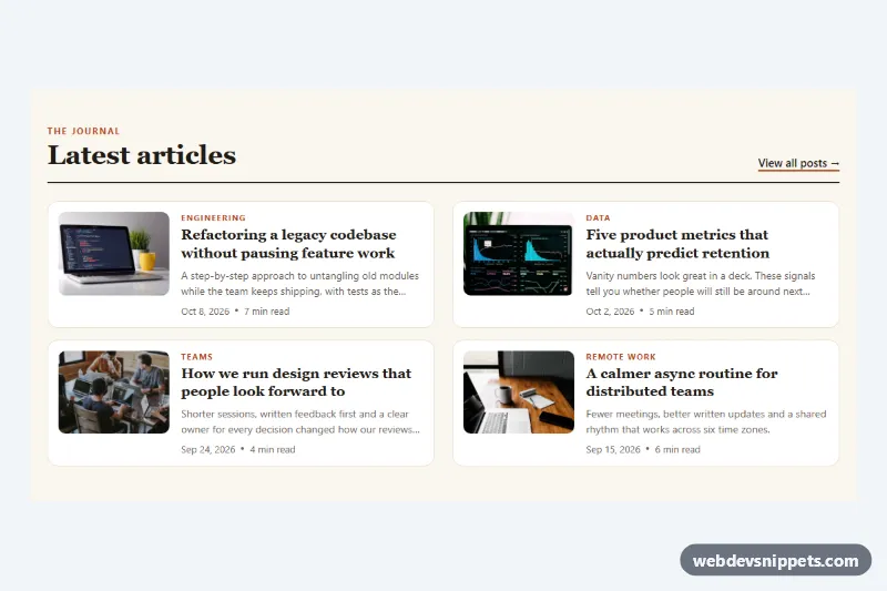
Blog Post List with Thumbnail Images
Compact pure CSS blog list with thumbnail images, category labels, clamped excerpts, dates and reading time, in one or two responsive columns.
Post lists, article previews and blog layouts.
4 component(s)
Compact pure CSS blog list with thumbnail images, category labels, clamped excerpts, dates and reading time, in one or two responsive columns.
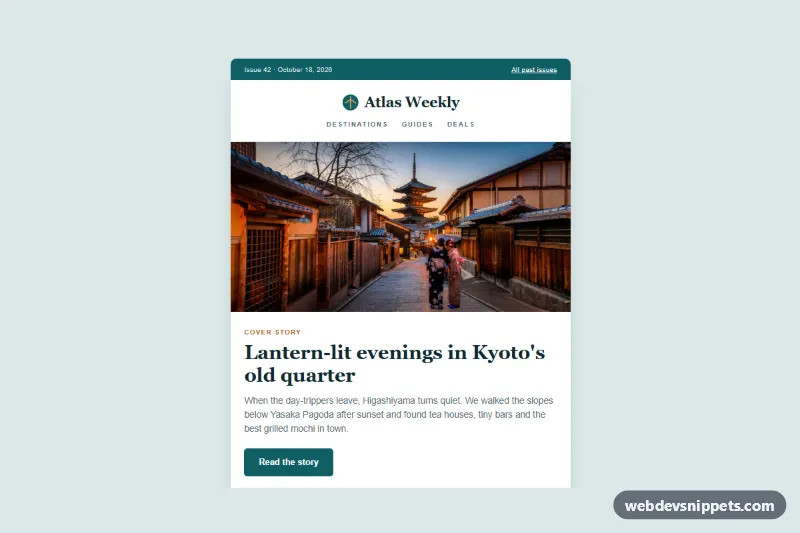
Travel magazine article digest in plain HTML and CSS with a cover photo, lead story, two-column photo articles, a feature block and a dark footer that stacks on mobile.
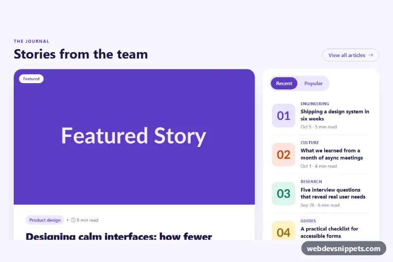
Bootstrap 5 blog section with a large featured article card and a tabbed sidebar of recent and popular posts.
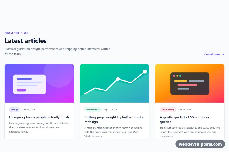
Responsive three-column Tailwind CSS blog grid with illustrated covers, category badges, author, date, reading time and fully clickable cards.
A blog section presents articles or posts in a structured way. It can be a grid of post cards on a homepage, a "latest articles" strip, a featured post with smaller items beside it, a list with excerpts or an author box at the end of an article. Each item usually shows a cover image, title, short excerpt, date, category and author. Blog sections are used on company sites, news pages, documentation hubs and personal websites.
Add one to bring recent or relevant content to pages that otherwise would not show it, such as a homepage or product page. On the blog itself, use list and grid layouts to make archives easy to scan.
<article> element and use a heading for the title; the whole card can link to the post, but keep a single link per card to avoid repeated announcements for screen readers.<time datetime="..."> element for dates.alt text or empty alt when they are purely decorative.aspect-ratio and object-fit: cover to avoid layout shift.srcset.These blog section examples come in Bootstrap 6, Bootstrap 5, Tailwind CSS and pure CSS. Bootstrap versions are built from cards, the grid and badges for categories, and Bootstrap 6 variants use the theme-* colour roles for tags and accents. Tailwind CSS versions use utility classes, and pure CSS versions use CSS Grid and custom properties. Filter by framework, look through the layouts in the live preview, then copy the HTML and CSS from the code tabs or download it. Connect the markup to your CMS or static site generator template and the blog grid is ready.