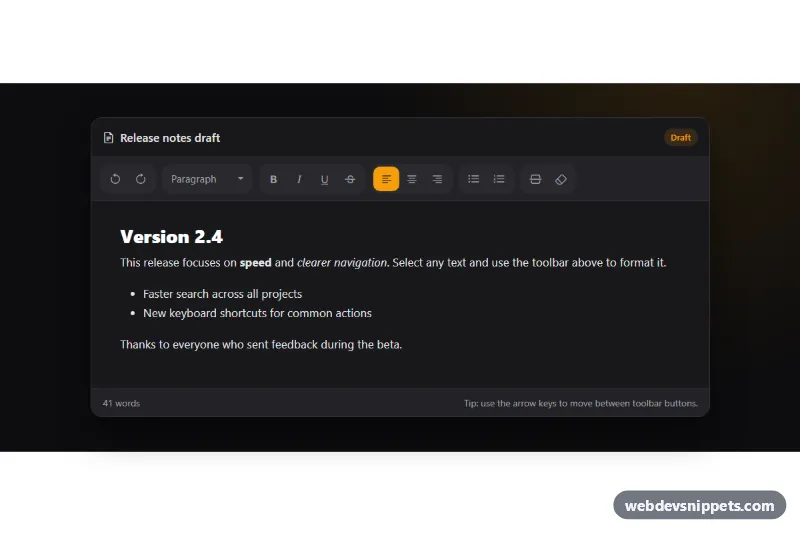
A dark Bootstrap 5 button toolbar for a rich text editor, with icon buttons grouped into history, block style, text style, alignment, lists and insert sections, connected to a small editable document so every button really works. Use it for comment boxes, CMS fields, note apps and admin panels.
How it works
The root is section.etb-editor with data-bs-theme="dark", so Bootstrap's own parts (like the dropdown) match the dark design. Inside .etb-shell, the .etb-toolbar is a Bootstrap btn-toolbar with role="toolbar". Each .etb-group is a btn-group with role="group" and its own aria-label. Every .etb-btn carries a data-etb-cmd value such as bold, justifyCenter or insertOrderedList. The block style menu is a Bootstrap dropdown whose items use data-etb-block (p, h2, h3, blockquote). Below the toolbar sits the .etb-area editing surface (contenteditable), and .etb-footer shows a live word count in .etb-count.
The script stores the current text selection on every selectionchange inside the area. A mousedown handler on the toolbar prevents the selection from being lost, and before each command the saved range is restored, then document.execCommand() runs and focus returns to the button. After each change the script asks queryCommandState() which styles are active and sets aria-pressed on the toggle buttons, which turns them amber. The dropdown label shows the current block type from queryCommandValue('formatBlock').
Customization
--etb-accentand--etb-accent-rgbin.etb-editor: change the amber color of pressed buttons, focus outlines, caret and quotes.--etb-shell-bg,--etb-bar-bgand--etb-borderin.etb-editor: adjust the editor and toolbar surfaces.--etb-radiusin.etb-editor: make the buttons square or rounder.- Add a button with a
data-etb-cmdvalue (for examplesubscript) to an.etb-group; add the command toSTATEFULinscript.jsif it should show a pressed state. - Add an item with
data-etb-blockto.etb-menuand a label inBLOCK_NAMESfor more block types. min-heightandmax-heightin.etb-area: change the size of the writing area.- Remove
data-bs-theme="dark"and override the custom properties for a light toolbar.
Accessibility
The toolbar follows the ARIA toolbar pattern with a roving tabindex: only one button is in the Tab order, and the Left and Right arrow keys, Home and End move between buttons. Toggle buttons expose aria-pressed, every icon button has an aria-label plus a title tooltip with its shortcut, and icons are aria-hidden. The dropdown toggle's label announces the current block style. The editable area has role="textbox", aria-multiline and a label, and native shortcuts such as Ctrl+B still work and update the button states. Focus is shown with a solid amber outline.
Usage notes
Requires Bootstrap 5 (bundle with Popper for the dropdown) and Bootstrap Icons. execCommand is deprecated but still supported by all major browsers; for production editors, keep this toolbar markup and connect the buttons to an editor library instead. Sanitize the HTML on the server before saving it.