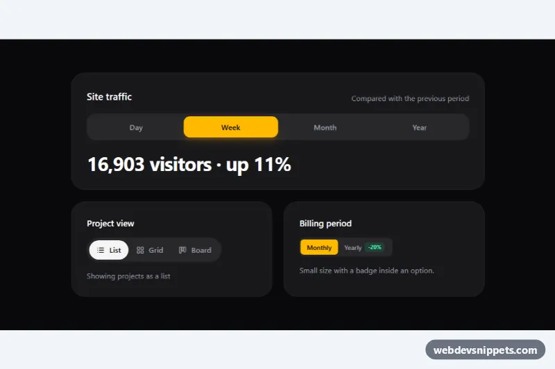
A segmented control built with Tailwind CSS: a compact button group where exactly one option is active, with a thumb that slides to the selected segment. The demo shows three versions on a dark zinc theme with an amber accent: a full-width time range switch that updates a statistic, a pill-shaped view switcher with icons, and a small billing toggle with a discount badge. Use it for dashboard filters, view modes, pricing toggles and settings.
How it works
Each control is a <fieldset class="tsc-control"> with a hidden <legend>, so it is a real radio group. Inside, .tsc-track holds the .tsc-indicator thumb and one <label class="tsc-option"> per segment. Every label wraps a visually hidden <input type="radio">, which means clicking, Tab and the arrow keys all work natively, and the form value can be submitted like any radio group. The checked label switches its text color with has-[:checked]:text-zinc-950, and keyboard focus is drawn around the label through has-[:focus-visible]:outline-2.
script.js initializes every .tsc-control on DOMContentLoaded. The place() function reads offsetLeft, offsetTop, offsetWidth and offsetHeight of the checked label and writes them to the --tsc-x, --tsc-y, --tsc-w and --tsc-h custom properties, which style.css uses to size and translate the indicator. The first placement happens without animation; afterwards the tsc-animate class enables the slide transition. A ResizeObserver on the track keeps the thumb aligned when the layout or fonts change. On every change event, if the fieldset has data-tsc-output, the data-tsc-detail text of the chosen radio is written into the element with that id.
Without JavaScript the indicator stays invisible and the fallback rule .tsc-control:not(.tsc-ready) .tsc-option:has(:checked) paints the checked segment amber, so the control still works.
Customization
bg-amber-400on.tsc-indicator: changes the thumb color; the view switcher usesbg-zinc-100for a neutral look.grid grid-cols-4on the first.tsc-track: equal-width segments that fill the card; useinline-flex(as in the other two) for segments sized to their content.rounded-2xl/rounded-full/rounded-lgon.tsc-trackand matching radius on.tsc-indicatorand.tsc-option: set the overall shape.data-tsc-outputon.tsc-controlanddata-tsc-detailon each radio: connect the selection to a live text area; remove both for a plain switch.transition: transform 0.3sin.tsc-animate .tsc-indicator: change the slide speed or easing.px-3 py-1.5 text-xson the billing options: the compact size; copy it for toolbars and table headers.
Accessibility
Native radio inputs inside a fieldset give screen readers the group name, the option count and the selected state for free, and arrow keys move the selection as users expect. The labels show a visible amber focus ring whenever the hidden radio has keyboard focus. Icons are aria-hidden, and outputs use aria-live="polite" so the updated statistic is announced. Text colors keep WCAG AA contrast on both the dark track and the bright thumb. The sliding transition is removed under prefers-reduced-motion.
Usage notes
Give each control on the page its own radio name so the groups stay independent.