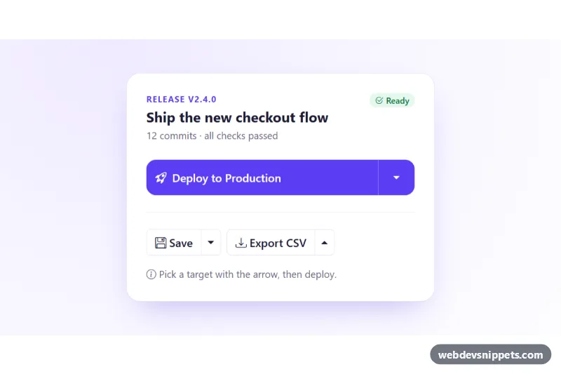
Split Button Dropdown
Bootstrap 5 split buttons: a primary deploy action whose target is chosen from an attached dropdown, plus compact save and export split buttons.
Grouped and segmented buttons.
3 component(s)
Bootstrap 5 split buttons: a primary deploy action whose target is chosen from an attached dropdown, plus compact save and export split buttons.
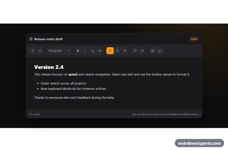
Dark Bootstrap 5 text editor toolbar with grouped icon buttons, toggle states, a block style dropdown, arrow key navigation and a working editable area.
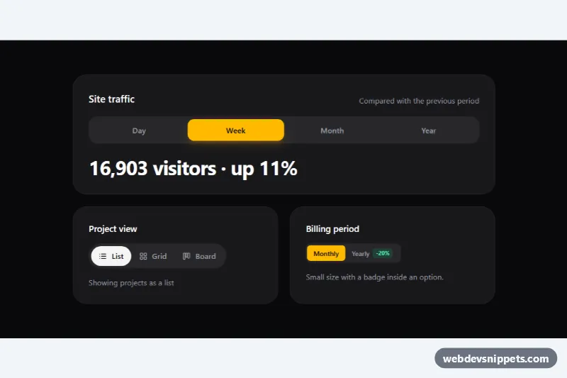
Tailwind CSS segmented control with a sliding thumb, built on native radio inputs for single-choice view, range and billing toggles.
A button group places several related buttons side by side in a single connected strip. It is used for toolbars in editors, view switchers ("List / Grid"), text alignment controls, filter sets and segmented controls that act like a compact set of radio options. Grouping makes the relationship between the actions obvious and saves horizontal space compared with separate buttons.
Give the wrapper role="group" and an aria-label such as "Text formatting" so screen reader users hear the context. For toolbars, role="toolbar" with arrow-key navigation between buttons matches user expectations. When a button represents an on/off state, set aria-pressed="true" or "false". For single-choice segmented controls, the most robust pattern is a set of visually styled radio inputs with labels, which gives correct keyboard behaviour out of the box. Make the active state visible by more than colour alone, for example with a filled background or a check icon.
You will find bootstrap button group examples and segmented button HTML CSS snippets for Bootstrap 6, Bootstrap 5, Tailwind CSS and pure CSS. Bootstrap 5 versions use btn-group and btn-check; Bootstrap 6 versions follow the new alpha markup and theme-* colour roles; Tailwind and pure CSS versions handle the joined borders and rounded outer corners themselves. Use the framework filter, compare the live preview, then copy the code from the code tabs or download it and rename the labels for your own toolbar.