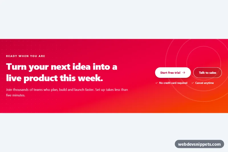
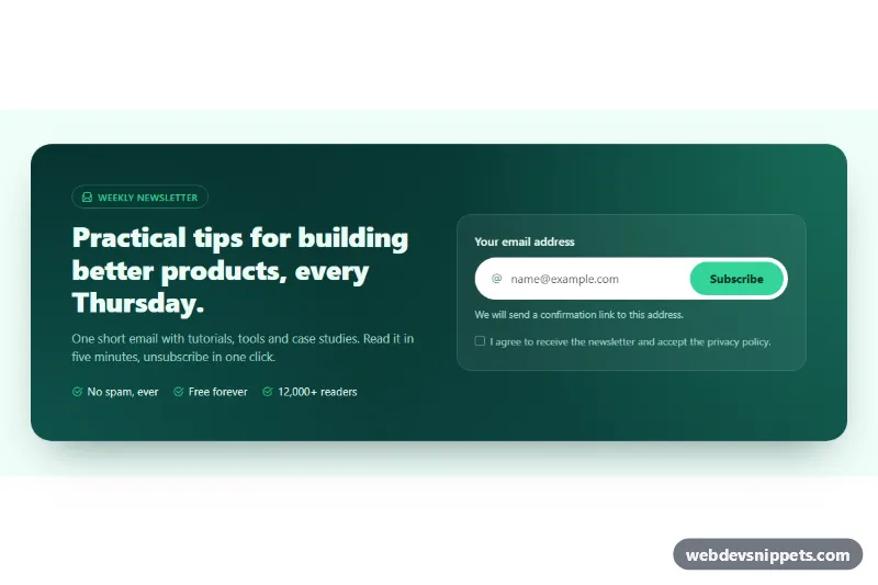
A bold, full-width call-to-action band built with Tailwind CSS: a rose-to-orange gradient, a large headline, a primary and a secondary button, and two short reassurance points. Place it between content sections or just above the footer of a landing page to turn readers into sign-ups.
How it works
The root is section.cb-banner. It uses bg-linear-to-br from-rose-700 via-rose-600 to-orange-600 for the gradient and relative isolate overflow-hidden so the decorative layers stay inside the band and behind the content.
Two decorative layers sit behind the text. The first is a ::before pseudo-element defined in style.css: a dotted radial-gradient texture that is masked with a linear-gradient, so it is visible on the left and fades out toward the right. The second is svg.cb-rings, three concentric circles in the top-right corner that rotate slowly with the cb-spin keyframes.
The content wrapper is a flex column on mobile and switches to a row at lg:flex-row, with the copy on the left and the actions on the right. On phones the buttons stack at full width; from sm they sit side by side. Both buttons carry the .cb-btn class, which lifts them by two pixels on hover, and the arrow icon .cb-arrow in the primary button slides to the right. The reassurance points are a small ul with check icons. No JavaScript is needed.
Customization
from-rose-700 via-rose-600 to-orange-600on.cb-banner: change the gradient stops, for examplefrom-indigo-700 via-violet-600 to-fuchsia-600; keep the left stop dark so white text stays readable.--cb-dot-colorinstyle.css: raise the alpha for a stronger dotted texture, or set it totransparentto remove it.--cb-dot-sizeinstyle.css: increase to32pxfor a sparser dot grid or lower to14pxfor a finer one.text-rose-700on the primary.cb-btn: set the button label color to match a new gradient.lg:flex-rowon the inner wrapper: change tomd:flex-rowto put copy and buttons side by side on tablets too.sm:text-5xlon#cb-title: lower tosm:text-4xlfor a quieter headline.- Delete
svg.cb-ringsfor a cleaner band without the rotating circles.
Accessibility
The band is a labelled landmark through aria-labelledby="cb-title". Both actions are real links with visible text, and they show a thick white focus-visible:outline-3 ring with an offset that stands out against the gradient. The secondary button has a bg-black/15 fill so its white label keeps contrast over the lighter orange end. All decorative SVGs use aria-hidden="true", and the reassurance points use role="list" so list semantics survive the reset. Under prefers-reduced-motion: reduce the ring rotation, button lift and arrow slide are disabled.
Usage notes
Requires the Tailwind browser build (added automatically) and the included style.css. Point the two href="#" values at your sign-up and contact pages. Multiple banners can share a page as long as each has a unique heading id.