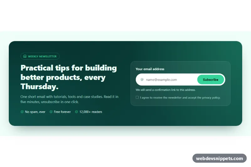
Split CTA with Email Capture
Bootstrap 5 split call-to-action with newsletter pitch on the left and a validated email signup form with consent checkbox on the right.
Sections that prompt users to take the next step.
2 component(s)
Bootstrap 5 split call-to-action with newsletter pitch on the left and a validated email signup form with consent checkbox on the right.

Bold full-width Tailwind CSS call-to-action band with a gradient background, two buttons and reassurance points.
A call to action (CTA) section is a focused block that asks the visitor to do one specific thing: start a trial, book a demo, download an app or get in touch. It typically contains a short, direct headline, one supporting sentence and one or two buttons. CTA sections appear at the end of landing pages, between content blocks, at the bottom of blog posts and just above the footer.
Add one wherever a visitor has just received enough information to decide. On a long page, repeating the same call to action two or three times is normal, as long as each instance has a clear purpose and does not compete with other offers.
<a> for navigation and a <button> only for actions on the page.You will find call to action examples for Bootstrap 6, Bootstrap 5, Tailwind CSS and pure CSS. Bootstrap 6 versions use the theme-* colour roles for backgrounds and buttons, which makes them easy to match to your brand; Bootstrap 5 versions use the familiar bg-* and btn-* classes. Tailwind CSS snippets are utility-only, and the pure CSS variants keep colours in custom properties. Filter by framework, check banners, split layouts and boxed CTAs in the live preview, then copy the HTML and CSS from the code tabs or download them. Swap the headline and link targets and the section is ready to drop into your page.