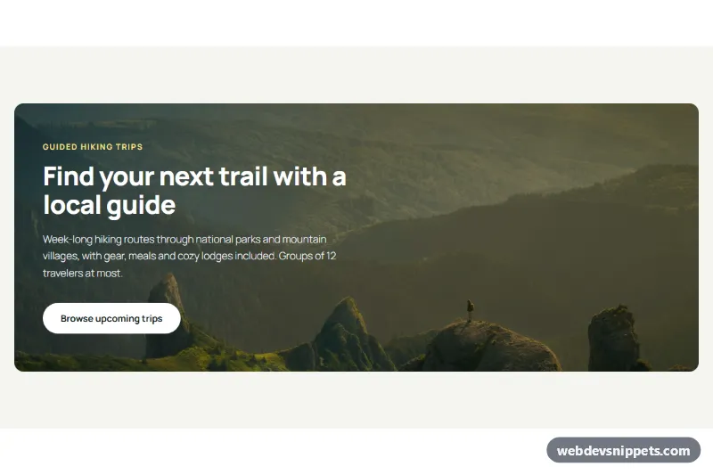
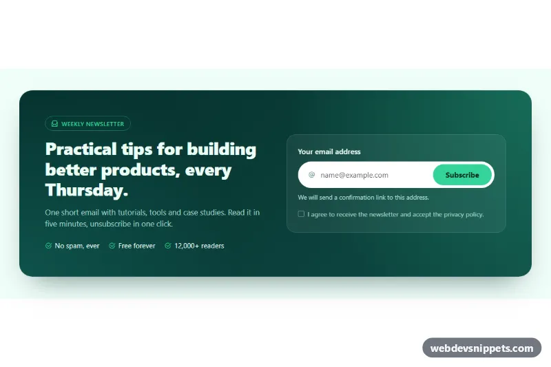
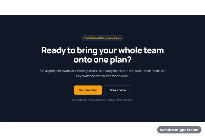
A call to action card with a photo background as a Gutenberg pattern: a rounded Cover block with a mountain photo, a dark overlay and left-aligned text, placed inside a light section. It works as an image banner with a button, a travel promo block or a featured offer card for tour operators, outdoor brands, hotels and event pages.
How it works
The outer Group is full width with a soft #f5f5f0 background, 96px vertical padding and a constrained 1160px layout. Inside it, a Cover block uses an Unsplash photo with a #0c1a14 overlay at 50% opacity, a 16px border radius, a minimum height of 500px and 64px / 48px padding. The content position is center left and the inner layout is constrained to 540px and justified left, so the text column stays readable over the photo. It holds an amber eyebrow paragraph, an H2, a paragraph and a white pill Button. On phones the card keeps its rounded corners and the text fills the card width.
Use cases
Travel agencies and tour operators: promote a trip type or season with a strong photo
Hotels and lodges: invite visitors to book a stay from the home page
Outdoor and sports brands: link to a new collection or a trail guide
Events and workshops: announce registration with a photo of the venue or activity
How to use it
Copy the block markup with the copy button.
Paste it into an empty paragraph in the block editor.
Replace the photo (Cover toolbar > Replace), the text and the button link.
Customization
Photo: select the Cover block and use Replace; Media settings > Fixed background adds a parallax feel.
Overlay: Cover, Color > Overlay #0c1a14, Overlay opacity 50; raise it for brighter photos.
Button: Color > Background #ffffff, Text #0c1a14, Border radius 999px.
Section background: outer Group, Color > Background #f5f5f0.
The photo comes from Unsplash and is a placeholder; replace it with your own image.
Accessibility
The Cover image has descriptive alt text, set in the Cover sidebar under "Alternative text". The dark overlay keeps the white text readable on the bright parts of the photo, the heading is a real H2 and the button is a link with a specific label.
Call to Action Card with Photo Background at a glance
Can I use the Call to Action Card with Photo Background code for free?
Yes. You can copy or download the block markup and use it in personal and commercial projects, including client work. No sign-up is needed. Reselling it as part of a component library or template collection is not allowed; see the license.
How do I add it to my WordPress site?
Copy the block markup, open a page in the block editor, click into an empty paragraph and paste. WordPress turns it into regular blocks that you can edit like any other content. You can also paste it in the Code editor view (Options menu > Code editor).
Does it need a page builder or plugin?
No. The pattern is built only from core blocks such as Group, Columns, Heading, Image and Buttons, so it works without Elementor, Spectra, Kadence or any other plugin. Colors and spacing are set on the blocks themselves; headings and text use your theme's fonts.
Will it look the same in my theme?
The layout, colors and spacing come with the blocks, so they carry over. Fonts, link styles and the content width follow your theme, so small differences are normal. The live demo shows the pattern in the default Twenty Twenty-Five theme. It works best with block themes; in classic themes the block editor still renders it, with your theme's styles.
Does it work on mobile?
Yes. The layout adapts to small screens. Use the Mobile and Tablet buttons above the live demo to check it at phone and tablet width.
How to install
Copy the block markup above.
Open a page or post in the WordPress block editor, click into an empty paragraph and paste. The editor turns the markup into blocks.
Replace the sample text and images. To reuse it, select the blocks and choose Create pattern from the block toolbar menu.
Uses only core WordPress blocks, so no plugin is needed. Tested with WordPress 6.8 and later. Fonts come from your theme; the live demo uses the default Twenty Twenty-Five theme. WebDevSnippets is not affiliated with or endorsed by the WordPress Foundation.
Call to Action Card with Photo Background · WordPress Call to Action