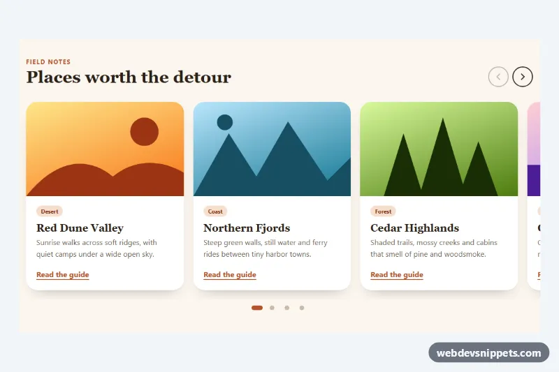
A Bootstrap 5 hero carousel with glass-style captions, pill indicators, round previous and next buttons and a pause/play control. The slides use CSS gradients and inline SVG landscapes instead of photos, so it loads instantly and works as a travel, product or campaign slider on landing pages.
How it works
The root section.ccx wraps a .carousel.slide.carousel-fade.ccx-carousel. Each carousel-item contains a .ccx-slide whose height comes from aspect-ratio: var(--ccx-ratio), a modifier class (.ccx-slide--sea, .ccx-slide--peak or .ccx-slide--dune) for its gradient, and an svg.ccx-art with simple shapes that scales with preserveAspectRatio="xMaxYMid slice". The .ccx-caption overrides Bootstrap's centered caption: it sits in the bottom-left corner, is left aligned and uses a translucent, blurred panel with a kicker, heading, short text and a .ccx-btn call to action. The .ccx-indicators become pills in the top-left corner, while the .ccx-control buttons and the .ccx-toggle pause button line up in the top-right corner so they never cover the caption.
Slide changes, indicators and swipe support come from Bootstrap's carousel plugin via data-bs-ride="carousel" and data-bs-interval="8000". The script runs on DOMContentLoaded, creates a bootstrap.Carousel instance for every .ccx-carousel and starts it paused when the visitor prefers reduced motion. Clicking .ccx-toggle recreates the instance with ride on or off, swaps the bi-pause-fill and bi-play-fill icons, updates the button label and sets aria-live to polite while paused.
Customization
--ccx-sea,--ccx-peakand--ccx-duneon.ccxinstyle.css: change the gradient behind each slide.--ccx-ratio: controls the slide shape; it is4 / 5on phones,4 / 3from 576px and16 / 7from 992px.--ccx-accent: recolors the kicker text and the.ccx-btnbutton.--ccx-glass: makes the caption panel darker, lighter or tinted.data-bs-interval="8000"on.ccx-carousel: sets the time per slide in milliseconds; the script reads the same value.- Replace an
svg.ccx-artwith animgfromhttps://placehold.co/1200x600or your own photo usingobject-fit: coverto show real images. - Remove
carousel-fadefrom.ccx-carouselto slide horizontally instead of cross-fading.
Accessibility
The carousel has aria-roledescription="carousel" and a label, and each item is a role="group" with aria-roledescription="slide" and a position such as "1 of 3". Indicator buttons have descriptive labels and aria-current on the active slide. The previous and next buttons include visually hidden text, and the pause button meets WCAG 2.2.2 by letting users stop the auto-rotation. Autoplay is off under prefers-reduced-motion: reduce, and all buttons show a white focus outline on :focus-visible.
Usage notes
Requires Bootstrap 5 with its JS bundle (added automatically) and Bootstrap Icons. When adding a second carousel, give it a new id and update every data-bs-target.