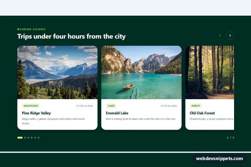
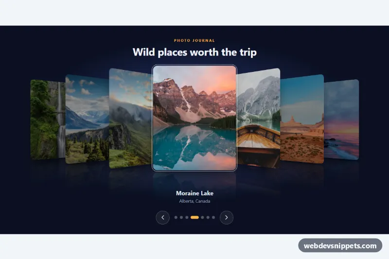
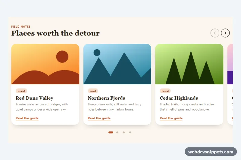
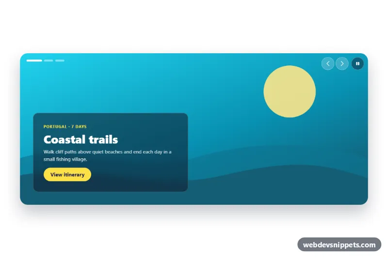
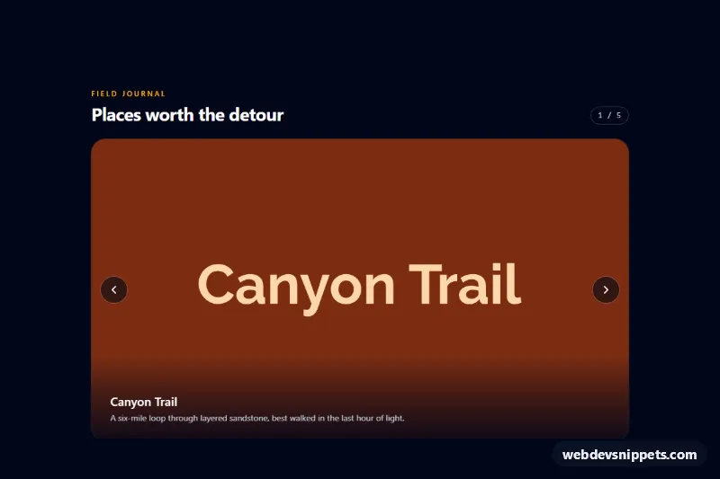
A swipeable card carousel built with Tailwind CSS and a small vanilla JavaScript controller, where each photo card is narrower than the track so the next card always peeks in from the edge. It fits travel guides, product collections, blog highlights and any "browse more" row on a landing page.
How it works
The root is section.tcp-carousel with aria-roledescription="carousel". The slides live in #tcp-track (.tcp-track), a flex row with overflow-x-auto, snap-x and snap-mandatory. Each .tcp-slide is an article with snap-start and a percentage width: w-[82%] on phones, sm:w-[46%] on tablets and lg:w-[37%] on desktops. Because no width divides the track evenly, part of the following card is always visible, which tells users there is more to swipe. Native touch and trackpad scrolling do the swiping, so the carousel already works without JavaScript; style.css only hides the scrollbar and styles the active dot.
The script initializes every .tcp-carousel on DOMContentLoaded. The data-tcp-prev and data-tcp-next buttons and the data-tcp-dot buttons call goTo(), which scrolls the track to the chosen slide with scrollTo(). A scroll listener, throttled with requestAnimationFrame, finds the slide nearest the left edge, sets aria-current on the matching dot, updates the data-tcp-current counter and disables the arrows at either end. When the track has focus, Arrow Left/Right, Home and End move between slides.
Customization
w-[82%] sm:w-[46%] lg:w-[37%]on each.tcp-slide: smaller values show more of the next card;lg:w-[31%]fits three cards plus a sliver.aspect-[4/3]andsm:aspect-[3/2]on the images: useaspect-squarefor product shots oraspect-[16/9]for a lower row.bg-emerald-950on the section andtext-lime-300on the eyebrow: swap forbg-slate-900andtext-sky-300to rebrand the dark band..tcp-dot[aria-current="true"]instyle.css: changewidthandbackground-colorto restyle the active pill.gap-4 sm:gap-5on.tcp-track: widen the space between cards; the script reads real positions, so no JavaScript changes are needed.- Add or remove
.tcp-slidearticles and matchingdata-tcp-dotbuttons; keep thearia-labelvalues ("1 of 6") and the total after the counter in sync.
Accessibility
Each card is a role="group" with aria-roledescription="slide" and a position label, and the section is labelled by #tcp-title. The track is focusable with an aria-label that explains the arrow keys, and it shows a lime focus outline. Arrow buttons have text labels through aria-label, are linked to the track with aria-controls and become disabled at the ends. Dots announce "Go to slide n" and expose the active one with aria-current. The counter is a polite live region. Under prefers-reduced-motion: reduce the script jumps instead of smooth-scrolling, and Tailwind motion-reduce:transition-none removes button and dot transitions.
Usage notes
The photos come from Unsplash; replace them with your own images and keep the width, height and alt attributes. Only the first image loads eagerly; the rest use loading="lazy". For several carousels on one page, give each track a unique id and update the aria-controls values.