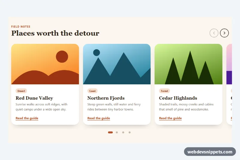
An image carousel with a clickable thumbnail strip, built with Tailwind CSS and dependency-free JavaScript. A large captioned slide sits above a row of small previews, so visitors can jump straight to any image. It suits product galleries, travel stories, portfolios and property listings.
How it works
The root is section.tct-carousel with aria-roledescription="carousel". Inside, the focusable .tct-viewport clips the .tct-track, a flex row of figure.tct-slide elements. Each slide holds an img and a figcaption with a title and short text on a dark gradient. Round previous and next buttons (data-tct-prev, data-tct-next) sit over the stage, a counter shows data-tct-current / data-tct-total, and .tct-thumbs is a horizontally scrollable row of button.tct-thumb elements.
On DOMContentLoaded the script initializes every .tct-carousel. Its goTo() function moves the track with translateX(-100%) steps, marks the matching thumbnail with aria-current="true", makes hidden slides inert, updates the counter and centers the active thumbnail inside the strip with scrollTo, so the page itself never jumps. Clicks on the arrows or thumbnails call goTo(). A keydown listener on the viewport handles ArrowLeft and ArrowRight. Pointer events add swipe and mouse drag: while data-tct-dragging is set the track follows the pointer, and on release it changes slide if the drag passed SWIPE_THRESHOLD, otherwise it snaps back.
style.css adds the eased slide transition, the dimmed inactive thumbnails and the amber outline on the current one.
Customization
data-tct-loopon.tct-carousel: setfalseto stop at the first and last slide; the arrow buttons are then disabled at the ends.SWIPE_THRESHOLDinscript.js: lower it for more sensitive swipes, raise it to avoid accidental slide changes.aspect-[4/3] sm:aspect-[16/9]on each.tct-slide: useaspect-squareoraspect-[3/2]to match your photos.w-24 sm:w-32on.tct-thumb: make the previews larger or smaller.outline-color: #fbbf24in.tct-thumb[aria-current="true"]and thetext-amber-400label: change the accent color.opacity: 0.5in.tct-thumb: raise it for brighter inactive thumbnails.transition: transform 0.5sin.tct-track: speed up or slow down the slide motion.- Replace the
placehold.coURLs with your own images, keeping one thumbnail per slide in the same order.
Accessibility
Slides use role="group", aria-roledescription="slide" and labels such as "1 of 5"; inactive slides are inert and aria-hidden. Every thumbnail is a real button with a descriptive aria-label and aria-current on the active one; arrow keys, Home and End move along the strip. The viewport is focusable and responds to arrow keys, and the arrow buttons have sr-only labels. A polite data-tct-status live region announces the slide number and title. All controls show a visible amber focus outline, and transitions are disabled under prefers-reduced-motion: reduce.
Usage notes
Several carousels can share a page because the script scopes all queries to each .tct-carousel; give each copy unique id values.