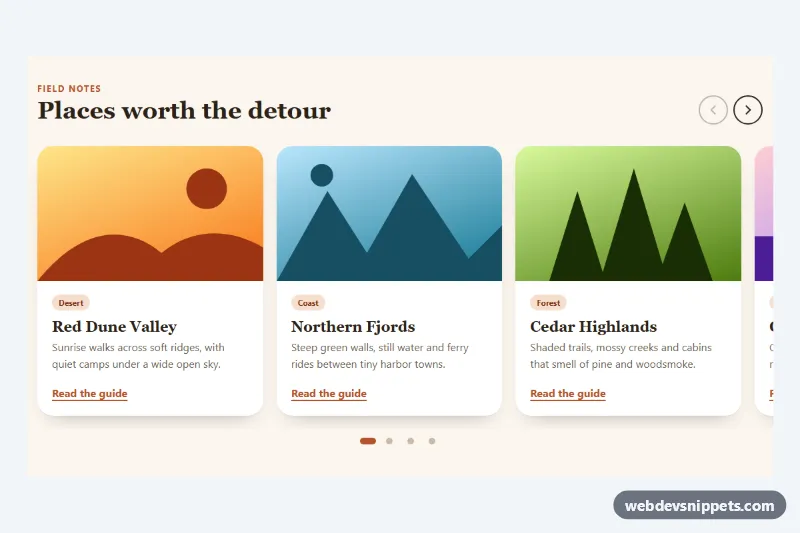
A lightweight carousel built on native CSS scroll snapping, with round arrow buttons and pill-shaped dots added by a small vanilla JavaScript file. It suits destination guides, product rails, blog highlights and any row of cards that should swipe smoothly on phones without a slider library.
How it works
The root section.ssc-carousel holds a header with the .ssc-title and the .ssc-arrows buttons, the scrolling ul.ssc-track, the .ssc-dots container and a visually hidden .ssc-status live region. The track is a CSS grid with grid-auto-flow: column, so the li.ssc-slide cards line up in one row. scroll-snap-type: x mandatory on the track and scroll-snap-align: start on every slide make each swipe, trackpad gesture or wheel scroll settle exactly on a card edge. Each card has an .ssc-art header drawn with a gradient and inline SVG shapes, followed by an .ssc-body with a tag, title, text and link.
The script measures the reachable snap positions of each carousel, so when three cards are visible there are only four dots instead of six unreachable ones. It builds one .ssc-dot button per position, listens for scroll (throttled with requestAnimationFrame) to mark the active dot with aria-current="true", and disables .ssc-prev or .ssc-next at either end. Clicking an arrow or dot calls scrollTo() on the track. A debounced resize listener rebuilds the dots when the layout changes. Without JavaScript the arrows and dots stay hidden and the track still scrolls and snaps natively.
Customization
--ssc-per-viewon.ssc-carousel: number of whole slides in view. The media queries set 1, 2 from 640px and 3 from 960px.--ssc-peek: how much of the next slide shows at the right edge, hinting that the row scrolls. Set0remfor no peek.--ssc-gap: space between slides, used both by the grid and by the width calculation.--ssc-accentand--ssc-accent-soft: color of links, the active dot, focus rings and the tag pills.--ssc-bg,--ssc-surfaceand--ssc-text: section background, card background and text color..ssc-art--dune,.ssc-art--fjordand the other art modifiers set--ssc-art-a,--ssc-art-band--ssc-art-shape; add your own modifier or replace the.ssc-artSVG with animg.--ssc-radius: corner radius of the cards and the track focus outline.
Accessibility
The section uses aria-roledescription="carousel" and is labelled by its heading; each slide has aria-roledescription="slide" and an "n of 6" label. The track has tabindex="0", so keyboard users can focus it and move between snap points with the Left and Right arrow keys, while Tab still reaches the links inside the cards. Arrow buttons and dots have descriptive aria-label text, and the .ssc-status region announces the visible slide after a button or dot is used. All interactive parts have a visible focus outline. With prefers-reduced-motion: reduce scrolling jumps instead of animating.
Usage notes
Several carousels can share one page; each .ssc-carousel is initialized on its own. Give each one a unique heading id for aria-labelledby.