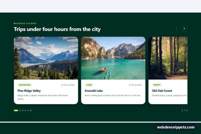
Card Carousel with Peek of Next Slide
Swipeable Tailwind CSS photo card carousel with scroll snap, a peeking next card, arrow buttons, dots and keyboard support.
Slideshows and content sliders.
5 component(s)
Swipeable Tailwind CSS photo card carousel with scroll snap, a peeking next card, arrow buttons, dots and keyboard support.

Coverflow-style image carousel with rotated 3D side photos, reflections, captions, dots, swipe and keyboard navigation in pure CSS and vanilla JS.
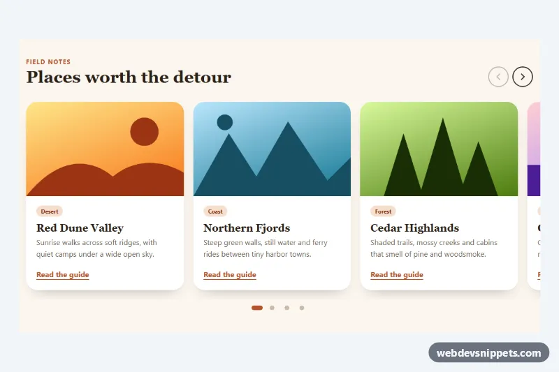
Native CSS scroll-snap carousel with arrow buttons, synced pill dots and keyboard support, enhanced by a few lines of vanilla JavaScript.

Bootstrap 5 hero carousel with glass captions, pill indicators, previous and next buttons, a pause control and gradient SVG slides.

Tailwind CSS image carousel with a clickable thumbnail strip, captions, swipe support, arrow-key navigation and optional looping.
A carousel, also called a slider or slideshow, shows a series of items one at a time or a few at a time in the same space, with controls to move between them. Items can be images, testimonials, product cards, hero slides or logos. Carousels appear on homepages, product galleries, onboarding screens and anywhere several items compete for limited space.
Use a carousel when the items are of similar importance and browsing them is optional, such as a product image gallery or a row of related products. Avoid hiding critical messages in later slides, since many users never advance past the first one.
aria-label="Next slide".prefers-reduced-motion.aria-label and give each slide a label such as "Slide 2 of 5".aspect-ratio to avoid layout shift, and lazy-load images on slides that are not visible.The carousel examples include Bootstrap 6, Bootstrap 5, Tailwind CSS and pure CSS versions. Bootstrap 5 versions use the carousel component with its JavaScript, and Bootstrap 6 versions load it as an ES module and use the theme-* colour roles for controls and indicators. Tailwind CSS versions combine utilities with a lightweight script, and pure CSS versions use scroll-snap for swipeable sliders with little or no JavaScript. Filter by framework, try the sliders in the live preview, then copy the HTML, CSS and JS from the code tabs or download the files.