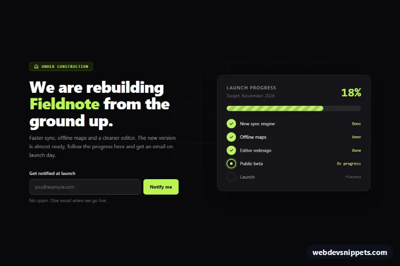
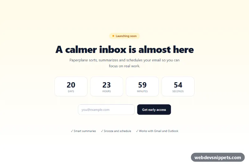
A dark "under construction" page built with Tailwind CSS that shows how close a relaunch is: a striped launch progress bar, a milestone list that marks finished, current and planned work, and an email form for launch notifications. Use it as a temporary landing page while a product, store or site is being rebuilt.
How it works
The root is .tcp-page, a full-height main element with the data-tcp-progress attribute. Behind the content, .tcp-grid draws a faint blueprint grid with two linear gradients and a radial mask. On large screens the layout is two columns (intro and form on the left, progress panel on the right); on phones they stack.
On DOMContentLoaded the script reads data-tcp-progress, clamps it to 0–100 and animates the .tcp-fill bar from zero to the target while the data-tcp-value number counts up. It also updates aria-valuenow and aria-valuetext on the role="progressbar" track. Each milestone li.tcp-step has a data-tcp-at threshold: steps at or below the progress get data-state="done", the first unfinished step becomes current (with aria-current="step"), and the rest are upcoming. The data-tcp-tag label is filled with Done, In progress or Planned, and style.css styles the .tcp-dot circle for each state.
The notify form (data-tcp-form) validates the email, shows errors in the role="status" message, and simulates saving with a short setTimeout. Replace that timeout with a fetch() call to your mailing list provider. Without JavaScript the bar still shows the static w-[72%] width.
Customization
data-tcp-progresson.tcp-page: set the completion percentage; the bar, number and milestone states all follow it.data-tcp-targeton.tcp-page: the launch date (YYYY-MM-DD) shown indata-tcp-date; when empty or past,DEFAULT_DAYSfrom today is used.data-tcp-aton each.tcp-step: change the percentage at which a milestone counts as done, or add and remove list items.--tcp-accentinstyle.css: swap the lime accent of the bar fill and done dots; also replace thelime-300utilities in the markup.--tcp-stripeinstyle.css: adjust the contrast of the moving construction stripes, or remove theanimationon.tcp-fillfor a static bar.lg:grid-cols-[1.1fr_1fr]on the inner grid: change the column ratio between the intro and the progress panel.
Accessibility
The bar is a real role="progressbar" labelled by the panel heading, with aria-valuetext such as "72% complete". The large animated number is aria-hidden to avoid duplicate announcements. Milestone status is written as visible text, and the current step carries aria-current="step". The email field has a visible label, aria-invalid on errors and an aria-describedby link to the live status message. Buttons and inputs have visible focus rings. Under prefers-reduced-motion: reduce the bar and counter jump straight to their final values and the stripes stop moving.
Usage notes
The script initializes every .tcp-page on the page; give extra instances unique id values for the label and input. This is a full-page template meant to be the only content of the page.