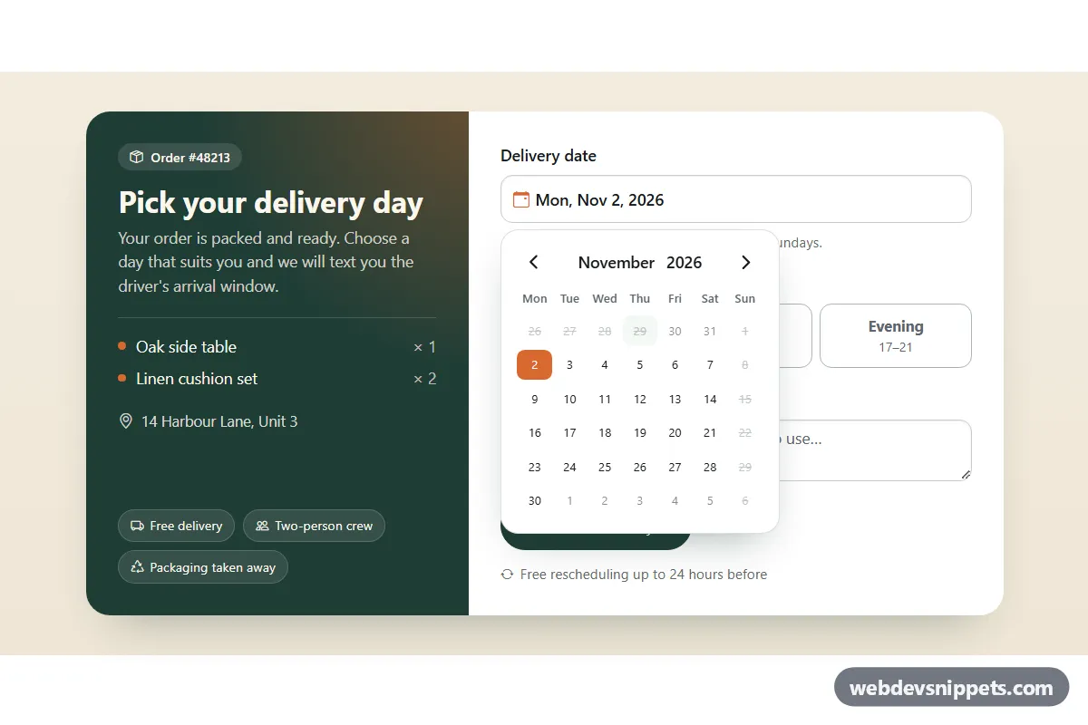
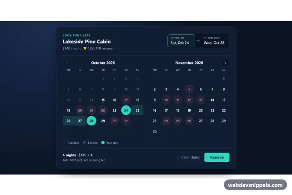
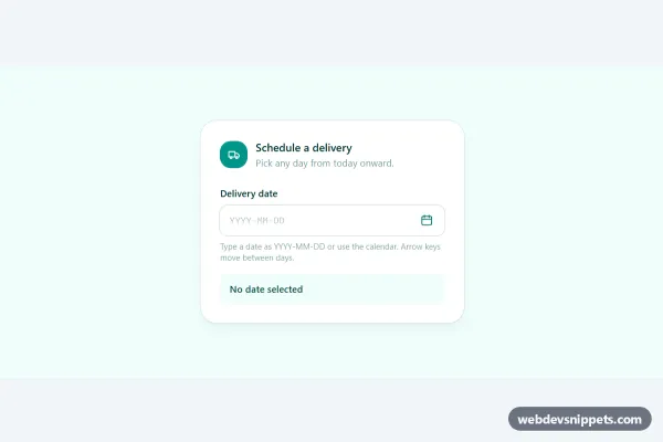
A delivery scheduling card that attaches the new Bootstrap 6 Datepicker to a text input. Dates before tomorrow and after 45 days are blocked, and Sundays are closed. The card also has a time-window picker, an optional note and a simulated booking. Use it for checkout steps, appointment forms or any input where only some dates are allowed.
How it works
The input .dpi-input sits inside a label.form-control.form-adorn with a calendar icon and carries data-bs-toggle="datepicker". Because the wrapper is a .form-adorn, the popup aligns to the whole field. script.js imports Datepicker from the Bootstrap 6 bundle and creates the instance before the data API does, so the limits apply on the very first open:
dateMinanddateMaxare computed relative to today fromdata-dpi-min-daysanddata-dpi-max-dayson.dpi-root, so the demo never shows stale dates. The hint.dpi-rangeprints the same range.vcpOptions.disableWeekdaystakesCLOSED_WEEKDAYS(Sunday) and greys those days out.vcpOptions.styles.calendaradds thedpi-calclass to the popup, which Bootstrap attaches to<body>, so it can be themed.dateFormatshows the choice as "Mon, Nov 2, 2026" in the visitor's locale.- With
data-dpi-suggest, the first open weekday two days after the minimum is preselected.
The change.bs.datepicker event clears errors. Typed ISO dates such as 2026-11-20 are checked against the same rules and passed to setSelectedDates(). On submit, getSelectedDates() must return a date, otherwise the field gets .dpi-field--invalid and aria-invalid="true". A valid submit shows a spinner, then the .dpi-done success alert. Replace the setTimeout with a fetch() call to your API.
Customization
data-dpi-min-days/data-dpi-max-dayson.dpi-root: the first and last bookable day, counted from today.CLOSED_WEEKDAYSinscript.js: weekday numbers to disable, for example[0, 6]for weekends.- Remove
data-dpi-demo-openfrom.dpi-rootin production. It only opens the calendar on page load for the preview. - Remove
data-dpi-suggestto start with an empty field. --bs-datepicker-day-selected-bgand the other variables in.dpi-cal: recolor the popup calendar.--dpi-pine,--dpi-orangeand--dpi-creamon.dpi-root: the side panel, accent and text colors.- Add or remove time windows by editing the
.dpi-slotlabels in.dpi-slot-group.
Use cases
- Delivery and order forms: customers choose a date within a window relative to today
- Service booking: Sundays are closed and a time-window picker completes the slot
- Appointment pages: minimum and maximum dates prevent choosing past or distant days
- Checkout flows: validation and a simulated booking confirm the chosen date
Accessibility
The input has a visible <label> and aria-describedby pointing to the range hint and the error. Errors set aria-invalid and show a text message, not only a red border. Time windows are native radios inside .btn-check labels, so arrow keys move between them. Keyboard users can also type a date instead of using the calendar. The success alert is a polite live region. Disabled days use a strikethrough as well as a lighter color.
Bootstrap 6 notes
Bootstrap 5 had no datepicker. Bootstrap 6 ships one (built on Vanilla Calendar Pro, included in the bundle), so you no longer need a third-party plugin. input-group icons become form-adorn with form-ghost, toggle buttons use <label class="btn-check"> with the input inside, and spinner-border-sm is spinner-sm. Built on 6.0.0-alpha.1. The Datepicker API is new and may still change. Icons come from Bootstrap Icons.