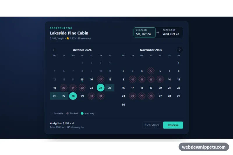
Booking Date Picker with Disabled Dates
Bootstrap 5 check-in and check-out date range picker with a two-month calendar, booked dates, minimum stay and price total.
Date and time selection controls.
2 component(s)
Bootstrap 5 check-in and check-out date range picker with a two-month calendar, booked dates, minimum stay and price total.
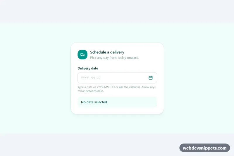
Accessible Tailwind CSS date picker: a text input with a calendar popup, keyboard grid navigation, locale-aware labels and min/max dates.
A date picker is a form control for choosing a date, a time or a date range. Typical designs open a small calendar popup from an input, show inline calendars for booking, or combine a date with a time selector. Date pickers are used in booking forms, filters, reports, scheduling tools and checkout flows where a delivery date is chosen.
<input type="date"> and type="time" first; they give users the familiar picker of their device.aria-disabled.min and max to limit valid dates and validate on the server too.The date picker examples on this page include styled native inputs, popup calendars, inline calendars, range pickers and time selectors. Bootstrap 6 versions use theme-* colour roles and ES module scripts. Bootstrap 5 has no built-in date picker, so those versions combine form controls and dropdown positioning with small vanilla JavaScript. Tailwind CSS versions use grid utilities for the calendar, and pure CSS versions restyle the native date input. Preview, copy the HTML, CSS and JS, and adapt the date format to your locale.