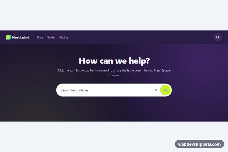
Expanding Search Bar
Search icon button that expands into a pill-shaped input, shown in a dark navbar and a large hero search, with Escape to close and a demo submit.
Components tagged with "input".
8 component(s)
Search icon button that expands into a pill-shaped input, shown in a dark navbar and a large hero search, with Escape to close and a demo submit.
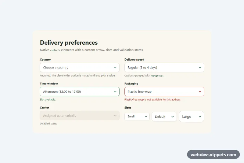
Pure CSS restyle of the native select element with a custom arrow, focus ring, error, success and disabled states, and three sizes.
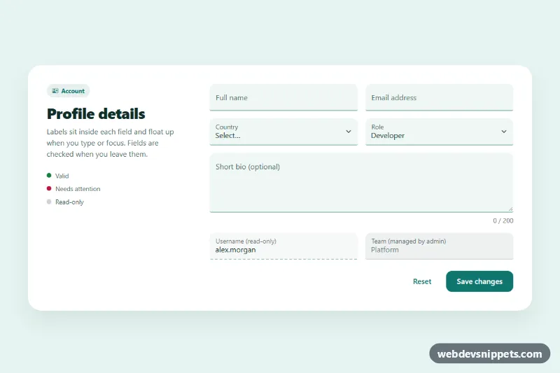
Bootstrap 5 floating label inputs for text, email, select and textarea, styled as filled fields with validation, read-only and disabled states.

Bootstrap 5 help center search bar with an accessible autocomplete list built from local data, highlighted matches, keyboard navigation and popular search chips.
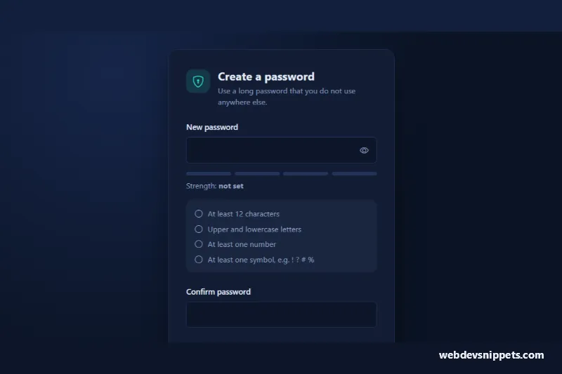
Bootstrap 5 password input with show/hide toggle, four-step strength meter, live requirements checklist and confirmation match check.
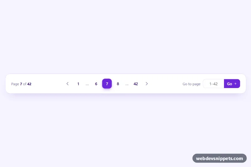
Bootstrap 5 pagination with smart ellipses, previous and next arrows, a page counter and a validated 'go to page' input.
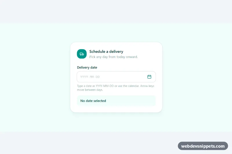
Accessible Tailwind CSS date picker: a text input with a calendar popup, keyboard grid navigation, locale-aware labels and min/max dates.
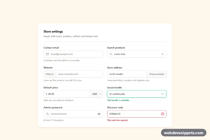
Tailwind CSS input group examples with leading icons, text prefixes and suffixes, a currency select, password toggle, clear button and helper text.