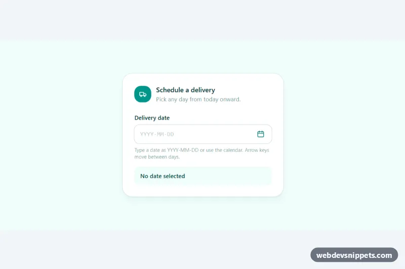
A date picker dropdown built with Tailwind CSS and dependency-free JavaScript: a text input with a calendar button that opens a month grid in a popup. It is shown as a delivery scheduler that blocks past days, and works just as well for booking forms, filters, due dates and checkout flows.
How it works
The root is .tdp-datepicker. Inside it, data-tdp-field wraps the #tdp-input text field, the calendar button marked data-tdp-toggle and the hidden #tdp-dialog popup (.tdp-popup). The popup contains previous/next month buttons, a month heading (data-tdp-month), a table role="grid" and the Today and Clear buttons. A readout paragraph (data-tdp-readout) shows the chosen date in long form.
On DOMContentLoaded the script builds the weekday headers and the 6 × 7 day grid with Intl.DateTimeFormat, so month and day names follow the locale. Each day is a button with a full-date aria-label; only the focused day has tabindex="0" (roving tabindex). Today gets aria-current="date" and a ring, the selected day is filled teal, days from neighbouring months are muted and days outside the allowed range are struck through and marked aria-disabled.
Opening the popup moves focus to the selected date (or today). Clicking a day, pressing Enter or Space, or choosing Today writes an ISO value such as 2026-10-15 into the input, updates the readout and closes the popup. Typed values are parsed on change; invalid or out-of-range dates set aria-invalid="true", turn the field ring red through .tdp-control:has([aria-invalid="true"]) and explain the problem in the readout. A pointerdown listener closes the popup when you click elsewhere.
Customization
data-tdp-week-starton.tdp-datepicker:1starts weeks on Monday,0on Sunday.data-tdp-locale: any BCP 47 tag such asde-DEorfr-FRtranslates month names, weekday letters and labels.data-tdp-minanddata-tdp-max: an ISO date ortoday; removedata-tdp-min="today"to allow past dates.DAY_SELECTED,DAY_TODAYand the other class strings at the top ofscript.js: restyle the day states, for example square cells withrounded-lg.- The
tealutilities inindex.html(bg-teal-600,ring-teal-600): swap forindigoororangeto rebrand. sm:w-80on.tdp-popup: widen the calendar, or addright-0and removeleft-0to align it to the button.
Accessibility
The toggle uses aria-haspopup="dialog", aria-controls and aria-expanded. The popup is a role="dialog" with aria-modal="true", labelled by the live month heading so month changes are announced. Arrow keys move by day and week, Home and End jump to the week edges, Page Up and Page Down change month (with Shift: year), Escape closes and returns focus to the button, and Tab cycles inside the popup. Alt + Arrow Down opens the calendar from the input. Each day reads as its full date, and the entrance animation is removed under prefers-reduced-motion: reduce.
Usage notes
For several pickers on one page, give each input, dialog and month heading unique id values and update for, aria-controls and aria-labelledby.